I previously decided I wanted the colour scheme to be based on swatches I had taken from one of his drawings, the pastel colours were really nice and calming and flowed well throughout his work. I just needed to come up with some sort of style for the layout of the design.

I came up with the title 'does this offend you' as I thought it linked together Egon Schiele's work and the research I had done into peoples ideas of nudity. This first layout was pretty randomly put together and didn't seem very appealing. I had tried to make things uneven but it looked strange. I chose Futura initially as I thought the modern sans serif look to the font was a nice contrast to the traditional expressionist art.

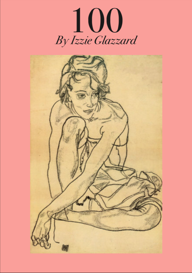
I even tried a variation of the design with the image pink but I think the painting lost its quality when I did this and it did not improve the layout.

This was my next design, I cut out the text and covered most of the image, leaving what would be considered as the most offensive part visible. I liked this design more than the others but it seemed wrong to cover parts of the image as it didn't communicate the full idea behind it.

This next design I actually liked quite a lot but something still seemed wrong, it seemed over complicated and like the type wasnt clear enough.

I tried this variation to make the type stand out more but I decided it needed to be much simpler.

I looked on its nice that for inspiration and came across this design. It initially caught my eye because of the pastel colour which I felt was similar to the style I was going for. I loved the serif font, the high contrast in weight it has makes it modern and sleek looking but very classy. I loved the whole layout and simplicity of this design and took inspiration.

I chose Bodoni for the typeface as its often used on fashion magazines and brands and I think it shows that even though theres nudity its still classy and not just simply pornography. I went with the same central image layout as the example I looked at. I added in a sentence briefly telling you what it was about at the bottom also. For the body text I decided to use Helvetica light, this kept it easily legible and it didn't clash with the bold title font.

For a lot of the 20 images I created double page spreads, the idea being it would be really bold and large when presented and could maybe shock people.

This is my first fact double spread. I decided to use Bodoni for the titles throughout the whole presentation so it all flowed nicely together. I used central text as I liked the really simple idea of everything being even. I created large margins at each side of the text as I liked the large empty space it created, it looks minimal and breaks up the information.


I carried the same theme and layout through the presentation and was really happy with the overall result.
It came to the presentation and one big thing I had forgotten was that the brief said '2 minute presentation' and id written way more than I should of done. I went through each slide and chose a sentence from each that I thought was interesting.
The feedback I got was that it was clear id done very in depth research and collected a lot of information but next time to remember the time limit and make it shorter. I was also told that for the next brief when it needed to be turned into a book to choose the most interesting things and make it into something people would find interesting to read the whole thing without it being daunting.
No comments:
Post a Comment