The Chemical Brothers - Let Forever Be
The Supremes - Reflections
The Maccabees - Go
Peter Gabriel - Sledgehammer
The Rolling Stones - Dead Flowers
St. Vincent - Digital Witness
Underworld - Born Slippy
There are 100 winners per song and the winning designs are printed and displayed at Somerset house in London. They are then sold at the end of the exhibition for £50 each. This money goes to charity.

These are the competition rules. The main thing being that I cannot include the artist name or song on the design as the point is the song stays a secret. The person buys the record just on its look and finds out which song it is when it arrives. 1000's of people from allover the world enter so its important to be original and not go for the most obvious outcomes.
The final requirements are 1 final designs and 4 others that I didn't decide to enter, a minimum of thirty thumbnail design ideas, blog posts and design sheets.
We did an exercise to help us create some initial ideas and also decide which song we wanted to do. Initially we just listened to each song and watched the music videos. The songs that I liked the most were by The Maccabees and St Vincent. The most visually inspiring video was Sledgehammer as it was incredibly complicated visually and gave me soo many initial ideas but I think a lot of people will choose to design for this song and Id rather avoid it for that reason. The St Vincent - Digital Witness video had a clear pastel colour aesthetic which was interesting and could be easily applied to my own design.

This is one of the experiments. We listened to the song Born slippy - Underworld. In pairs we took it in turns one person holding the pen and the other moving the paper. I found subconsciously I was moving the paper to the music which was an interesting way of capturing the song within an image.

This was drawn to the song Let forever be by Chemical Brothers. This next one was passed around 3 people and we were asked to draw what we saw in the music video. It was interesting and helpful to see other peoples interpretation of the song.

This was drawn to Sledgehammer by Peter Gabriel. We were asked to draw the things we heard in the song, bigger when the music was louder and vice versa. I actually found this hard as it was hard to listen out for significant words in such a small amount of time. The outcome was mostly sledgehammers which seems far too obvious so I didn't find this exercise as helpful as the others.

This one was drawn to Rolling stones - dead flowers. I think this was the most attractive and interesting outcome as its completely abstract but looks engaging and I found myself looking for images within it. We had to draw with a continuous line and I also chose to draw blind. This is something I may try again to other songs as once again the rhythm of the song effected how I drew.

This was drawn to Reflections by the supremes. We were told to write the words we heard in the song. Although this outcome is interesting I want to avoid lyrics in my design to make it less obvious of my song choice and keep that element of secrecy.

This design was done to Digital Witness by St Vincent. We were asked to use the wrong end of our pens and fold the paper to create a texture. It ended up pretty messy and I don't really think it reflected the song well but it did open my mind up to ways of making textures I could use in my design.

This final drawing was done to Go by The maccabees. We were asked to draw circles then squares, triangles and dots. I really love the idea of using simple geometric shapes to represent songs, its simple and effective and you could think more about reflecting the artist and song in colour choices and which shapes give of certain vibes.


These are some monoprints I created using very simple geometric shapes, after doing that task it made me realise these could be helpful in this brief. Although the shapes used are simple the organic textures made by the ink gives it an edgy and much more deep look which could represent an edgy song.

All the experiments were hung up so we could see other peoples interpretations of each song and it could help with ideas generation.

In groups we talked about which song to pick. I decided to go with Digital Witness by St vincent but I may explore some of the others if theres time as you can enter more than one design. I liked the song as it was really catchy, I also enjoyed the video and the colour scheme will be fun to play around with when transferring it onto a vinyl design. I also think this song won't be one of the more popular ones people will enter for as she is an emerging artist which gives me more of chance of winning an exhibition place.
Above are some initial idea sketches I did.
1. A vector illustrations of her curly silver hair which plays a bit part in the visuals throughout the music video and is a well known part of her identity as an artist. I would use a pastel background to also go with the theme of the video.

Above is a photo of the iconic hairstyle that inspired this idea.

Above in an example of a piece of vector art by a design studio called Cranio design. I really love their style of artwork and this could be a great inspiration when creating my vector hair for the design.
2. The video has a lot of simple and bold architecture which plays a big part in the minimal aesthetic. I came up with the idea of doing a simple vector skyline illustration, using only lines (no fill) and curving the edges which will play towards this simple style. Also once again using colours from the video.

Above is an example from the video of the buildings.
3.
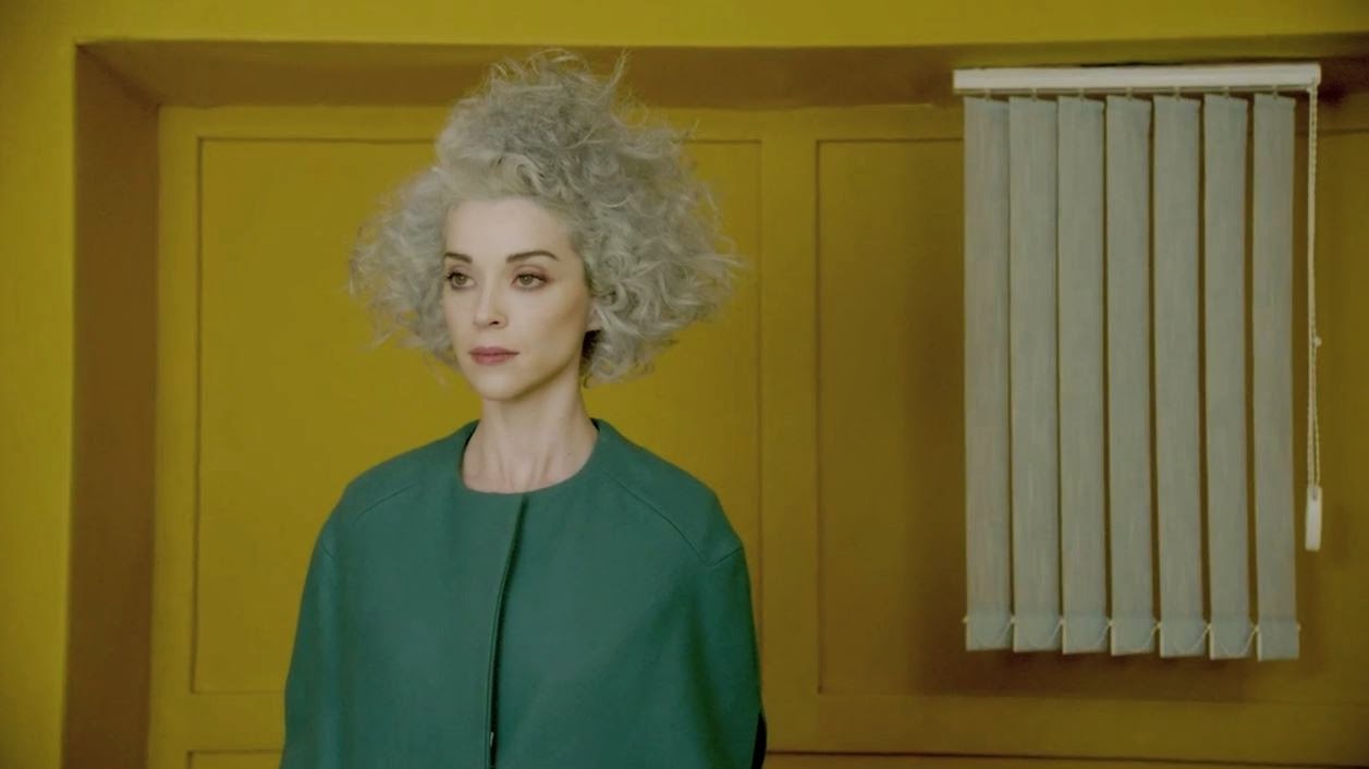
In this shot from the music video you can see some blinds not covering a window just randomly hanging. Im not sure of their significance but they feature a lot so I came up with the idea of doing a really simple vector of these blinds.
4. http://www.spin.com/articles/style-issue-st-vincent/ I read this article/interveiw with Annie Clark (st vincent). Once bold thing the interviewer said about her was how striking and anime like her eyes are. This gave me the idea I could do an illustration of her eye/s.
5. Going back to looking at minimal geometric forms the video features a guy holding a blue triangle. I could simply use this graphic for my design. This may also seem too obvious though and id be worried someone else would do the same design.

6. When discussing ideas with my peers someone pointed out how throughout the video she says 'yeah' in a distinctive way and how it was going to stick in their heads. This gave me the idea I could illustrate just that word.
7. I also looked at the lyrics in the song, one of the main ones being ''people turn the tv on, it looks just like a window''. This could be adapted into some kind of tv/window combination or an illustration that looks like white noise.

The the white noise idea would relate nicely to the meaning of the song. The song is about people obsession with social media and when I think about that subject it makes me think of when you talk to someone but their so involved with their phone they just don't hear you. This could be described as a human state of white noise.
8. My next idea was to play around with my monoprints on photoshop and use those outcomes. I could adjust the colours to go with those used in the music video.
9. Going back to the interview again, I found out Annie though of the name St Vincent after a hospital called St Vincent. I could use this bizarre fact and illustrate the hospital its-self.
10. Also in the interview he mentions her freckles, I thought I could do some kind of illustration of freckles. Keep it really minimal and simple.
11.

Looking at the colour scheme of the video reminded me of the photography in Toilet Paper magazine. Also reading and watching interviews with St. Vincent gave me the idea shes a really quirky person who would be into strange surreal imagery like this.

This is another image from the most recent issue of the magazine.
I looked into the meaning of the song being about how social media is taking over peoples brains, specifically the lyrics 'I want all of your mind'. This gave me the idea of having someone holding a brain and maybe squeezing it to physically have someone having all of a mind. It could even be on a plate with a knife and fork to suggest the mind was being consumed.
12. My next idea is similar to the last but to have someone licking a brain. This could be hard to find someone willing. For these two ideas I would have a bright coloured backing paper just like Toilet paper magazine and the colours in the video.
13.

This idea is to create a really simple vector of this blue object that features a lot in the music video.
14. Also in the video theres people with glasses full of yellow liquid, this made me think I could make a yellow coffee mug looking stain.
15. Moving on from the yellow liquid I looked at marbling ink and figured if I could match the colours from the video a simple pattern made with these could look great as part of a design.
No comments:
Post a Comment