Friday 27 November 2015

~Chicago Latino film festival design - development - responsive ~

After deciding due to previous winners a hand drawn based typography poster was appropriate I experimented with a few variations in style of lettering.


The initial sketches seemed unappealing and irrelevant to the festival itself as they were too 'script' typeface style which has the connotations of softness. But when looking at images of the city of Chicago itself and the way its been represented though type in the past you can see its all about strength and its huge sky rise buildings. Due to the nature of the city itself a more sans serif based type is more appropriate.


This is my hand drawn type solution, it combines both the illustrative side that represents festivals and the idea of the films being produced by individuals rather than mass organisation and direction companies; and the sans serif outline representative of the bold city the festival is being held in. 


For the other elements of type I wanted them to be a lot more subtle to enable the film festival type to stand out more to allow full appreciation of the intricate illustration. I created a hand drawn brush type then traced it in illustrator to allow for colour changes. The simple type reinforces the idea of 'hand made film'.


Wednesday 25 November 2015

~ sony music - video ~


The initial video footage was of marbling inks slowing moving around. This is relevant to the artist as the music style is psychedelic and creates a real experience that goes further than basic listening which can visually be interpreted in this calming and colourful way. 


The videos have been edited together to run smoothly as an infinite loop. The colours have also been completely changed so they now run along with the aesthetic of the album artwork making the site as much about the new release as possible.

Monday 23 November 2015

~ Website design - design production - brief 4 ~

https://www.youtube.com/watch?v=vs4i41cOv0s

Ive chosen to do the website design for the band Temples. Their current psychedelic aesthetic spreads throughout their music, videos, artwork etc. and can be an important and inspiring element within the design of the site. 


The first idea for the website to encourage the audience to be as interactive with it as possible is to embed a function like the one above. It allows the audience to upload a photo (or even link with their Facebook albums) and turn them into kaleidoscope images. The image could then be shared on all social media elements and include the bands logo. It would also link back to the website itself encouraging more traffic and awareness. 


I plan to use this brief to utilize new skills in different areas of design. As a graphic designer I don't need to know how to fully code a website. But learning how to use wireframe software creates a framework thats understandable to the web developers and tells them how the site should function. For this brief I will use the wire frame software Axure. 


To ensure the site grabs and holds the audiences attention by being as interactive as possible I want elements of the site to move and be animated. To help me achieve this I want to use Adobe Flash.


https://www.youtube.com/watch?v=4fAudTjK6E0
The work of Suminagashi is a relevant aesthetic to the psychedelic nature of the bands music. He uses marbling style inks on top of water (using pippets) to create images that capture the flow and movement of liquid. This style of image making could be a really effective approach to a style for my website as it could be applicable to still and moving image. 


Friday 20 November 2015

~ User experience - sony music brief ~

To inspire and influence our decisions in web design we had a talk on user experience by Kimberly Bottomley (@freebydesign). 

- what people need and want
- reflecting that though the design
- customer support

User experience is important to be applied to web design but also every aspect of design. Putting the users interests at the heart of design is important for success.

User experience is the overall experience of a person using a product using a product such as a website or computer application, especially in terms of how easy or pleasing it is to use; according to Googles definition. But in fact its so much more than that.

A users experience is more broadly though of is how the use of format, layout, composition, images colour, sound and a whole load of media considerations effect peoples emotions and ease of experience when interacting/viewing something. 

Market research is an important factor. Asking what parts of a design is good or bad and how it effects them as the customer? Beginning to understand how a person interacts with a product is an important factor. It's about creating 'moments of joy' to inspire and grab the customers attention. 

Important things include; button placement, transitions between pages/links, drop down box's, research & testing, behavioral psychology, data analysis, persona development, product design, requirement gathering, information architecture, nomenclature, copy writing, tone of voice, problem exploration, solution discovery, prototyping, interaction design, interface design, responsive, performance, visual design, brand, marketing, customer service, design culture.

Semiotics are important for web design, certain symbols are instantly recognisable to a global audience even faster than using words are. A perfect example being the symbol of an arrow for directions. 


Step 1 - A good first step is to quite simply predict the target audience & demographic information of a person most likely to visit your site/product. This isn't fool proof as you can be wrong but you can take multiple perspectives and its a completely free way of looking at the target audience and predicting what those people want. 

Step 2 - Challenge your initial assumptions. Survey people (survey monkey), Twitter quiz, Facebook, ask the public, observation. Avoid questions that persuade a certain opinion/direction of answer from a person. Observation is applicable to this brief as you could go to gigs of the band/genre, look at videos/images of previous gigs and look on social media at the audience thats talking about the band. 


As a result of this presentation I created an initial persona development of who the target audience of my website could be. Assessing and predicting the demographic information, behaviors, needs and goals of the potential target market allows me to decide what needs the web design can full fill. 

Just from this initial persona some ideas that are key for this site are-
- Create a connected feeling to the artist (skype, meet and greet, photos of the band)
- The aesthetic should be contemporary and attractive to a 15-25 audience
- Pop ups/prompts to competitions, offers and chances to buy the album and merch
- Bright colours, patterns and interactive elements (video/animation)

Monday 16 November 2015

~ Latino film festival - initial research ~

http://www.graphiccompetitions.com/jump.php?contest=chicago-latino-film-festival-poster-contest 


The festival offers the experience of Latin America, Spain, Portugal and even the USA without people having to leave Chicago. 


Due to the general aesthetic and theme of the previous years winners it seems the judges appear to like an illustrative and textural style of design which is something to consider when producing my design.


~ Penguin book brief - design - responsive ~


Due to research into the previous winners of the competition a hand drawn design seemed appropriate to this brief. After doing initial research into the book and film I came up with 3 design influences for the design. Psychedelic artwork, the elongated nose during one of the key scenes and the symbolism of clockwork parts. 

Above you can see one of my initial sketches. The brief stated the design should engage with both front and back covers of the book. The long nose has been illustrated to spread across both sides of the design to fully incorporate the image to the books format. 


From this initial sketch I began to produce a vector version of the design. But this instantly lost its illustrative aesthetic and become too clean cut. I wanted my design to be inclusive of more negative space and reflect the complex psychological horror element and theme of the book.

Keeping with the main framework and concept of the initial sketch I further developed the idea using purely illustration.


Keeping within the previous facial shape guidelines produced in the initial sketch I created illustrations that have connotations of horror, murder, blood and a grid pattern representative of prison. My illustrative style is quite easy going and almost friendly looking, this is a positive in terms of the books content. The main character Alex is a psychopath and disillusioned in terms of his crimes, thinking them to be good fun. This is represented well within this style of illustration as it looks fun but as you look closer you realise the objects within the illustration are representative of death.

From this face illustration I then hand drew type in the style of some psychedelic poster designs previously looked at using a free flowing and warped aesthetic. Using this is both relevant to the time of the books production and the idea of warped and sick thoughts being produced in someones brain.


Rather than re-vectoring the design it's scanned and live traced to ensure the illustrative (imperfect) qualities of the design aren't lost. The use of orange is iconic to the books design quite literally due to it's title its become recognisable to the books audience.


In the context of just looking at the design of the books cover the illustration is placed within the format so the side profile of the face is still visible and recognisable & its not until you turn over the book that the elongated nose becomes apparent. This encourages the audience to pick the book up and actually read the books blurb (taking further interest).


Sunday 15 November 2015

~ studio brief 4 - possible bands ~

This brief is to create the website design for a band/artist of our choice. The website wont be a main site but just to promote the release of a new album. The idea is that the website helps increase pre-sales/sales of the album. The website and campaign must excite fans and engage with them on as many occasions as possible.

The deliverables are low quality wire frame designs to show people the layout and function of the web design. And an aesthetic design of the website on both mobile and desktop computer formats. 

To promote the release further these are a few ideas of the events that could connect with fans during the promotion. 

Event calendar - Meet & greet the band
Skype Q & A
Song release
Music video release
Scratch of part of the album cover 
Win a signed vinyl
Email alerts


A few of the bands websites I came across used the blogging platform Tumblr as the base of their sites. This allows people to follow the website and reblog any of the elements put onto it. Because this brief is to create a site that is temporary and to promote an album release a bloggable website could be perfect for making the news easily sharable. 


I felt a few of the websites were pretty successful already and I wanted to take something that could be hugely improved to develop into my own interpretation of the brief. 

Thursday 12 November 2015

~ Responsive - individual practice - secret 7 ~

I engaged with secret 7 last year and despite not winning a place I found it to be one of the most enjoyable briefs. This has lead me to the decision to use it as my most substantial brief for this module. To do this I plan to submit an entry for all 7 songs. I want this brief to allow me to explore different mark making techniques and visual styles within my work.

https://www.creativereview.co.uk/cr-blog/2015/december/record-sleeves-of-the-year-our-top-10-from-2015/#.Vo7oOQo4ZDE.facebook
As a starting point I read this article on the 10 best album covers of the year.

Via this I discovered the designer Robert Beatty, his work mostly features on album covers.


His work is combination of digital work in almost Dali-inspired style. His work is incredibly surreal and takes you to another world. I find this style incredibly inspring and it's not something i've personally seen on many albums.


Tuesday 10 November 2015

~ Type in context - production & crit ~


Pre production I tested the pagination and format of the book to ensure the book would print correctly and most size effectively.


I kept the inside page simple as I planned to clear foil the title onto the cover so I thought in forcing this for ease of legibility on the inside pages would be effective. I also introduced the second format section of the book at this point to create consistency throughout the publication.


I printed on a thin matte stock then screen printed gloss onto the images so they were the only gloss element of the publication. This is effective in producing a sharp image and good texture combination but the stock choice meant the paper became wavy when wet. In reflection if I was to produce this again i'd choose a thicker stock to avoid this issue. But in commercial printing I would of used UV spot varnish rather than screen printing to apply the gloss which would avoid the wavy paper problem completely.


Throughout the book I used 4 shades of Colour plan stock in varying shades of blue. I chose the colour blue as it's relevant to Hull being a costal city that relies on the marina for trade and tourism. Colourplan stock is available in all different variations of colour which made it perfect for this one off publication but would also be easily applied in commercial printing as G.F.Smith provides stock for most printers in the UK. I chose to create a gradient order within my stock to mimic waves, further enforcing the idea of water. 


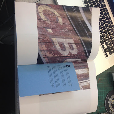
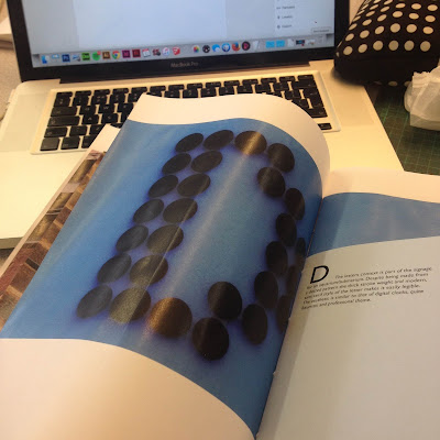
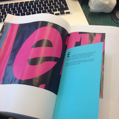
These images above show the variations in stock and the wave like gradients they create throughout the book. 


I decided to saddle stitch my book as it creates a hand crafted look which will appeal to a creative audience that appreciate work produced by hand more than mass produced work. This binding method is still applicable using commercial printing methods with the same hand crafted feeling to the overall publication.

The book has a lot of flaws due to the stock being too thin so when screen printed upon its become wrinkled which looks un professional. A way to avoid this would be to use thicker stock (silk so it automatically becomes glossy when printed upon) and smaller (which makes it more applicable as a city guide).

CRIT

I asked for the crit how I could create a more effective and high class looking book thats more cost effective.

The solutions I came to for making improvements are ...
- Perfect bind the book - a tighter bind will stop the book from 'flapping' around, looking cheap and becoming damaged if its carried around as a guide.
- Keep bright white stock? -  as it keeps the attention on the photography. You can use silk stock that when photos are printed on appears as gloss, achieves the same result as the gloss screen print but its more cost effective and stops the wrinkling of the paper.
- On the other hand an organic stock could also work as it relates to the hand drawn, rough looking type and area the books content is focusing on.
- Cut down the information, reduce the letters to the attractive ones only? or just hand type? Also cut down the body copy, keep it a guide about the city and let people evaluate the type for themselves.
- Another way to save money is to print all the pages on one sheet of stock to reduce wastage. 
- Use a thicker cover stock, protects the inside content and looks more high quality. 
- Consider what image I want to portray of the area.