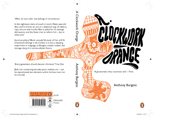
Due to research into the previous winners of the competition a hand drawn design seemed appropriate to this brief. After doing initial research into the book and film I came up with 3 design influences for the design. Psychedelic artwork, the elongated nose during one of the key scenes and the symbolism of clockwork parts.
Above you can see one of my initial sketches. The brief stated the design should engage with both front and back covers of the book. The long nose has been illustrated to spread across both sides of the design to fully incorporate the image to the books format.
From this initial sketch I began to produce a vector version of the design. But this instantly lost its illustrative aesthetic and become too clean cut. I wanted my design to be inclusive of more negative space and reflect the complex psychological horror element and theme of the book.
Keeping with the main framework and concept of the initial sketch I further developed the idea using purely illustration.
Keeping within the previous facial shape guidelines produced in the initial sketch I created illustrations that have connotations of horror, murder, blood and a grid pattern representative of prison. My illustrative style is quite easy going and almost friendly looking, this is a positive in terms of the books content. The main character Alex is a psychopath and disillusioned in terms of his crimes, thinking them to be good fun. This is represented well within this style of illustration as it looks fun but as you look closer you realise the objects within the illustration are representative of death.
From this face illustration I then hand drew type in the style of some psychedelic poster designs previously looked at using a free flowing and warped aesthetic. Using this is both relevant to the time of the books production and the idea of warped and sick thoughts being produced in someones brain.
Rather than re-vectoring the design it's scanned and live traced to ensure the illustrative (imperfect) qualities of the design aren't lost. The use of orange is iconic to the books design quite literally due to it's title its become recognisable to the books audience.
In the context of just looking at the design of the books cover the illustration is placed within the format so the side profile of the face is still visible and recognisable & its not until you turn over the book that the elongated nose becomes apparent. This encourages the audience to pick the book up and actually read the books blurb (taking further interest).


No comments:
Post a Comment