Thursday 27 November 2014

Photoshop tutorial (OUGD405)

As an introduction to Photoshop we were asked to create a film poster using photography and manipulating it. I wanted to try the mini planet photomanipulation out to see how successful it would look for the rest of the brief. I thought the most appropriate film for this would be Inception as its all about miniature dreamscapes. 


I found a perfect 360 panorama of a big city similar to the type you see a lot in the film. I followed an online tutorial and created this effect. Afterwards the image was square and the clouds were blurred so I used a second image and a layer mask to create a neater cloud effect around the edge and giving me some space for text.


Next I wanted it too look more moody and dark so I adjusted the brightness and contrast which looks much more appropriate. I also made it portait as most film posters are traditionally this format so it looks more professional.


This is my final poster design, I used Gotham book font as its the one used on the actual film posters and thought it was nice and bold. Also similar to their posters I increased the tracking as it looks much more bold and in your face. I added a drop shadow as I found it hard to find a colour for the font without it looking to high contrast or blending in. Overall I am happy with this and using Photoshop in this way taught me a load of new techniques. I definitely think I will experiment with this technique further for this brief.


Monday 24 November 2014

Frame shape idea generation (OUGD405)

I decided to take a look at the kind of images you see in existing photo frames for an idea of the general style and any themes.


This example is from John Lewis. I really love the simplistic design with the beautiful quote inside. The typeface used is really light and peaceful looking. I could experiment with the idea of using quotes and photography together for my images. This also includes the dimension information and name of the store which I should also include on my design.


This is another of John Lewis' designs. Its really minimal and attractive, appealing to people with similar style in interior design. I love the idea of the circles within the rectangle shape. I could incorporate this idea within photography.


I created this quick mock up on photoshop of how I could incorporate the circle shape and photography to give an interesting and minimal aesthetic. I can do this with photography of nature, buildings and possibly even people.


This example shows your really typical overly happy family photo displayed in the frame which you see all to often and is something I want to avoid at all costs.

Another typical image you tend to see in photo frames is landscapes. It would be interesting to try find a way of making this idea more interesting and more to do with shape.


I came across a really interesting method of photomanipulation called small planet photography. The method needed a 360 degree panoramic then uses photoshop to create this effect. I think this takes boring and typical landscape photography and completely transforms it. This also creates brilliant circle based shapes and would be an effective idea to try and incorporate into my designs.

Looking at the theme ideas I came up with a few ideas for designs. 


My first idea was to find flowers and scan or photograph them to then manipulate into shapes or words in photoshop. I then realised this time of year there is an abundance of flowers so I collected some leaves with variation in colour that I will later scan and play around with digitally. I had ideas about a double exposure style type image.

Another idea was that if you chose a frame with no edges you could create a backing image that spread out of the frames edges and 'break the rules' this could be a really interesting concept. 

Another theme was geometry, I love geometrical pattern and it could be great to somehow incorporate this with photography and possibly even nature? Maybe create some patterns out of things I find on the floor (twigs, leaves?).


This is a quick mock up I created on Photoshop I did by manipulating images of the same leaves. But I could create an image like this physically maybe and try photographing it? 


OUGD405 - Collect, categorise, communicate

OUGD405 is the new module, the hand in date is the 19th of January at 2pm

An initial aim I have set for myself in this module is to do each design board as I go along to avoid a big stress at the end like last time. 

Studio brief 1- Design process- frame shape (Photoshop) OUGD405

This brief is to reimagine the backing paper you see in photo frames. 
We need to design 3 images that work as a set and can be different dimensions to each other to change it around.
The concept should be based on the idea of shape.
I will need to think about the target audience I am designing for (Wilkos frame would differ from Harvey Nichols.)
Explore a range of concepts and themes.
Look at different types of frame and their current images.
Choose a theme.
Choose 3 specific formats and dimensions
Do design board! 
The deadline is 5th December, 9.30

Possible themes could be-
  • shape
  • nature
  • geometry
  • time
  • universal
  • contradiction
  • family
  • tradition
  • organics
  • memory
The point of this brief is to explore the use of photography and Photoshop so I will need to include this in my final images.

Friday 14 November 2014

Module evaluation (OUGD403)

This module has been a really great start to the course. I loved that we started with a type based brief as its an area I really wanted to explore further. The first brief Alphabet Soup was really good as it gave me chance to experiment with my drawing skills and imagination. The second brief challenged my Illustrator skills and I learnt a lot in the workshops which will be helpful in the future. It was great to design my very own typeface as its not something I thought id ever be able to do. Also the final poster prints for the brief looked really good and it was satisfying to see the typeface displayed well. The third brief was just research which isn't the most fun thing but it only lasted a week and it was challenging trying to perfect my folded leaflet I designed to present what I found. The fourth brief was the one I found the most challenging as posters are something you'd expect to be easy but original ideas were really hard to come up with. I particularly found the image only poster hard to come up with ideas for as i'm use to using type to help communicate a message but it was a good challenge. Using the vinyl cutting machine was a new experience for me and the result was really effective and I will definately be using it again in the future. One thing that went wrong in brief 3 was the ink on the leaflet kept falling away but I solved it by changing the colour and using the black and white printer instead. I also had problems with the placement of the text but after some prototypes I perfected it. This showed me the importance of doing test prints before final ones to save myself money in future projects.

Overall this module has been extremely challenging as the workload has been hard as my timekeeping needs to improve. Next module I will aim to keep on top of all of my blog work so I don't end up having loads to do by the end of each week. The crits were good as I enjoy looking at other peoples work but I wish people would maybe give me more constructive criticism as sometimes I came away from them feeling not helped. I am happy with the final pieces I have designed and the typeface is my favourite as it seems like a big achievement and looks great. I am enjoying the course so far and look forward to the next module. The only bad thing was the amount of money I managed to spend on printing which I will have to get use to and account for next time. Im really glad that the course is quite challenging as it helps me push myself further in my practice and will make me improve. For the next module I will do each design board after I finish each brief to make it less of a panic at the end, I will also make sure my attendance stays at a good level as I don't want to miss out on anything this year.

Typeface posters - vector type OUGD403

The deliverables of the vector type brief included some a3 posters presenting our typefaces, we needed to print them in the digital print room with the inkjet printers.


I did three posters in total one with a sentence using every letter, one with the regular typeface and one of the bold. I also created two smaller designs showing how it could be used in context. I chose to do them white on black as it looked really high contrast and grabs you instantly. I printed them on matte card so they look high class and the type of thing you'd expect to see from a reliable and big font company. I thought the printed finals looked way more amazing than the digital versions.


This close up photo shows how cleanly all the lines printed which I was really happy with.


I also printed out my grid onto tracing paper so it could be placed over my letters. But I created it using grids on Illustrator so the print was a screen shot and very low quality so it doesn't look good. But in the production of my typeface I didn't really use my grid so it just shows the idea really.


Final posters - message and delivery OUGD403


This is my final type only poster. I printed this on matte card as I think its a high quality and class looking finish. The colours came out really bright and bold so it really stands out and grabs your attention. I think this poster is successful in showing the extreme pushy ways charity trys to get you to donate your organs, I really wanted to do something controversial that would spark conversation. It is also still promotion for the cause as I originally intended.


This is the second poster I printed, but I have decided I wont be using it as one of my final three as the images were jpegs and came out slightly pixelated so I prefer my alternative design.


Instead this is the type and image final poster. I love the hypnotic pattern that is enhanced by the bright colours due to high quality printing. I also printed this one on matte card for a clean finish. 


For my third poster I did I decided to create a window sticker. I began with matte black vinyl to make a silhouette look to the image. I then decided it could look better in red as its the actual colour of the heart transplant logo. I decided the red was best in the end but it was good to have the black left over to show the process. 


This is my final poster/sticker actually applied. It looks really effective in the environment, you could place them in tourist attractions on windows looking out onto picturesque views and this would definitely capture peoples attention. 

Overall I am really happy with the final posters as the print finishes are so clean and accurate so they look very bold and in your face which is what I wanted. 


Wednesday 12 November 2014

Image only poster (OUGD403)

I found out the cutting machine at university only cuts vinyl not paper. Which is not my original idea but I think it could still be really effective designing a poster made for windows rather than walls. I also have decided to go with the same idea of a child being the focus of this poster but I want it to be much more simple than the first design.


So this is my newer and much simpler version. I think the simplified version will be much bolder and stand out a lot more as a serious poster. I also decided to up the guilt idea and made the main figure of the poster a baby. I added the heart donation logo also to make the message more clear as I think its quite a recognisable logo.

Tuesday 11 November 2014

Poster development (OUGD403)

One of my ideas was to create a paper cut of a young boy, I decided to use a missing puzzle piece to show that he needs a donated heart as its quite childlike symbolism. Then like Rob Ryan's work surround him with trees but with puzzle pieces hanging from them, I wanted the trees to look quite menacing and evil to make you feel sorry for the boy. The idea being it shows the guilt you are made to feel for him if you do not donate.


This is what the design will look like and hopefully it will be possible to get something cut by machine with this much detail.


In order for the right parts to be cut out for my final poster I had to invert the design. When it comes to cutting it if I have the time I might experiment with different colours of paper. The final image could be mounted onto a background colour or even to be hung in a window which could look really interesting.


Negative space (OUGD404) Design principles

Today we were introduced to negative space in graphic design, most commonly seen in logo design. 


One of the most well known examples is the FedEx logo where you can see and arrow shape created by the negative space between the E and x. 

We were told to choose a word and have a go at creating our own negative space ideas. I chose the word space (I think i'd just heard it so many times) and wanted it to be related to outer space, rockets and aliens. 


This was one of my ideas, I drew a rocket with a negative letter S inside. I wanted to focus on just changing one or two letters within the word to keep it simple and subtle.


This was my next idea, I basically did some illustrations round the letter s but I think this is too overcomplicated so I started thinking of some more simplified ideas.


The next idea was to make the A look like a rocket but in this sketch I got the kerning a bit wrong so I wanted to do a second sketch.


This is my second sketch of the same idea of the A rocket, I rotated the letters around it asif they had been blasted apart but I still wasn't sure it was simple enough.


I tried simplifying the idea so the rocket shape just filled the letters counter but in this sketch its not very obvious what it is.


These last sketches are just changing one letter in really simple ways buy adding ufos, rockets and aliens. My favourite of these it the letter E which I have decided to experiment with digitally.


This is my idea took further digitally and I think its really effective, I like that its still eaisily legible because its such a subtle change.


And lastly I inverted the colours and added a slight gradient and also some light bubbles to add a space feeling to it giving it more context.


Monday 10 November 2014

Interim crit - Message and delivery - Studio brief 4 (OUGD403)

I presented all of the posters I created so far in this crit. People really liked the idea of being mildly offensive with the posters and partly making a mockery of the forceful tone of voice you see on the British heart foundation website. The 'Donate your fucking organs' design was said to be effective but is commenting more on the tactics designers and writers use to persuade people to donate and how pushy it can be. Also the design I did with the illusion style heart could portray the same message that companies and charities are hypnotising you to donate (which isnt a bad thing) but my posters could take this to the next level and outrightly do that. If I were to go with that idea for my posters I will now need to come up with a similar idea for the just image poster. 


After having our digital print inductions and seeing the paper cutting machine it has inspired me to really want to use it for a project. I looked at the poster/papercut work by Rob Ryan and I really love the cute theme it has. The idea of heart charities using images of cute kids to make you feel guilty if your not on the donor list is something you see all the time. It could be really great to try do something in this style with that idea behind it. But first I will have to go to the print room and see if theres any slots free before the hand in as there wont be any point taking this idea further if it cannot be produced in time.

Thursday 6 November 2014

Poster development (OUGD403) Message and delivery


 This is one of my poster designs just using tracking to spread the letters.


And this is my improved version where I have tried to kern each letter to look more equally spaced, it may still need improving but its definitely better.

Poster designs so far (OUGD403) Message and delivery

After doing some initial research into other poster designs promoting organ donation and doing some initial sketches I decided to play around on Illustrator and see what I could come up with.


This idea is not complete yet as I think its really minimal and doesn't really get the full message across but I will ask some people their opinions on how to improve it. But its based on the idea of second life, the heart dying then being revived.


This is based on texting symbols of the <3 representing a heart but I once again don't think it gives the message about organ donation clear enough and would need adjusting if it was going to be a final image.


This next on was an idea for my all type poster. I thought I could add a few facts and lay them out in an interesting way and it could look pretty nice, Im unsure about this one as it might be a bit too hard to read as people say you need to grab peoples attention with a poster within 3 seconds of them seeing it.


The layout of the poster above was inspired by this one which is a design i've always really liked. But im not sure how well it works for this project.


This one was an idea to create a hypnotic op art look to the poster as personally I find anything that messes with my eyes a little irresistable. I used Futura as its a really geometric font that stands out so well and can be read easily even when it's laid out in a strange way. I really like this idea and its definitely a contender for the final 3.


This next design was taking a comedic and quite forceful approach which I thought people would laugh off and it would definitely grab peoples attention and cause a bit of controversy. I used Futura condensed as I wanted it to look bold but I thought it looked a bit plain and the colour was random so I could change it to green to make it more relevant.


This is my edited version of the idea, I used a bright bold green which is much more effective and changed the tracking and sizing of the type so it filled the page, I still could improve of this by editing the kerning to each letter had more equal spacing. I also made the please lowercase and a light grey so its subtly polite.


Next I really like the idea of using scientific illustrations as the vintage look is something people find really appealing these days. I searched the web for some royalty free images for the basis of my poster then laid over the phrase live twice. I love this phrase as I think its a really positive way of looking at organ donation and would encourage a lot of people. 


Fire exit sign rebrand (OUGD403)

As a mini brief we were asked to rebrand the current fire exit sign designed by Yukio Ota. We were put into groups and given two hours to come up with a new idea.


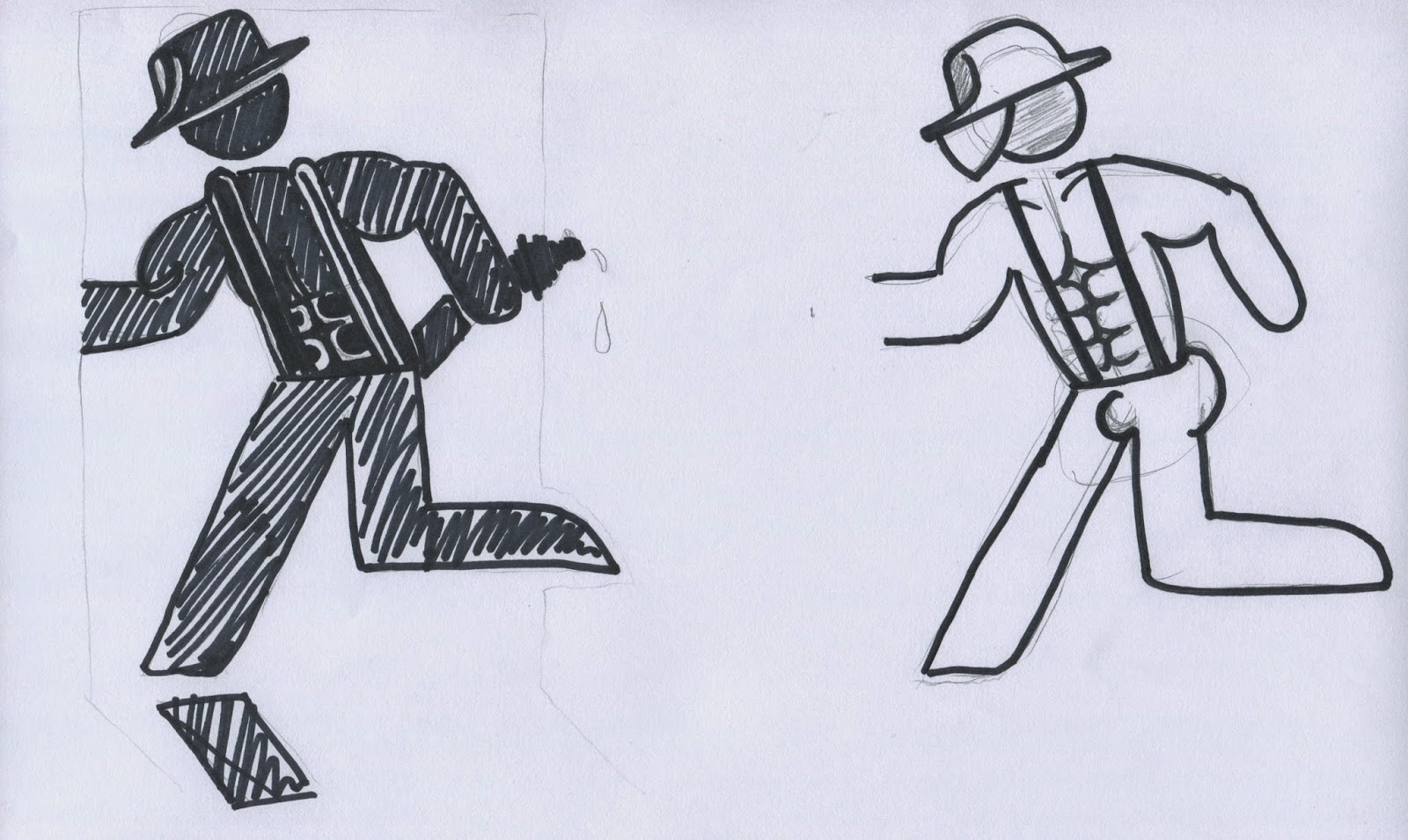
As a group we decided that the current design was really good and would be hard to improve in any significant ways. We did a mind map of ideas and the best ideas were less serious. So we went for a more comedic viewpoint and thought we could create funny variations of the current design that people could use. Our idea to show this was to do a sexy fireman/woman to add some lightheartedness to the sign, it would be based on the current one so from far away it would still be recognisable.


These are our initial idea sketches, we were trying to decide on how the hat would look and the six pack etc. I personally went for a female for my idea as I felt it was more subtle but still funny.


We also experimented with colour but later decided to stick to the green so it would still be recognised in an actual emergency.


This is the initial sketch of the female firefighter, its less 'sexy' so less offensive and more of a novelty for all. But it does look a little bit like a dutch dancer so we had to make some changed for the final design.


This is our final logo design, it would be in green for a final image but the black was for display purposes. I think its lighthearted and would still be recognisable to people unlike other designs that could be confusing especially to other nationalities. Our tutor agreed that the current design is very good so a variation was a good idea.


Example of another possible variation, simply a naked man. Still has the comedy aspect yet its simple and doesnt make the sign any less recognisable.