
As a group we decided that the current design was really good and would be hard to improve in any significant ways. We did a mind map of ideas and the best ideas were less serious. So we went for a more comedic viewpoint and thought we could create funny variations of the current design that people could use. Our idea to show this was to do a sexy fireman/woman to add some lightheartedness to the sign, it would be based on the current one so from far away it would still be recognisable.


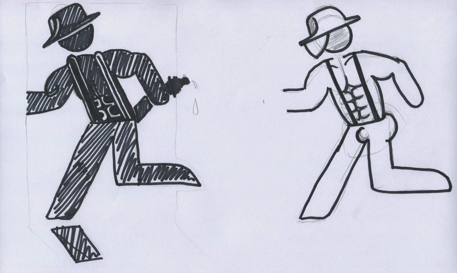

These are our initial idea sketches, we were trying to decide on how the hat would look and the six pack etc. I personally went for a female for my idea as I felt it was more subtle but still funny.

We also experimented with colour but later decided to stick to the green so it would still be recognised in an actual emergency.

This is the initial sketch of the female firefighter, its less 'sexy' so less offensive and more of a novelty for all. But it does look a little bit like a dutch dancer so we had to make some changed for the final design.
This is our final logo design, it would be in green for a final image but the black was for display purposes. I think its lighthearted and would still be recognisable to people unlike other designs that could be confusing especially to other nationalities. Our tutor agreed that the current design is very good so a variation was a good idea.

Example of another possible variation, simply a naked man. Still has the comedy aspect yet its simple and doesnt make the sign any less recognisable.
No comments:
Post a Comment