As a huge name in modernist design Vignelli's poster designs are all information based the main point of them being to get the facts across rather than design to persuade. They are about impact in a way that gets the information across in the most simple and effective way by organising it well.

The image above shows Vignelli holding up one of his designs. He used modular grids to create his posters with equal cell sizes to create a balance of information. You can see how simple the layout is with the large red text to the left and the body text to the right this clearly shows a hierarchy within the information and you can read left to right through the information really easily. Theres no other images or infographics on the poster just text which is something you see in most of his posters as he believed in design that got the point across in a simple way rather than complicating it with images. His simple style of design is really attractive to me as a designer but I think if you saw this you might feel the lack of image unappealing and the text heaviness might stop you from wanting to read it.
Bill Gold
I wanted to look at a designer who is the complete opposite of Vignelli and works with image more. I took a look at Bill Gold who is the designer of some really famous classic movie poster designs such as Casablanca, Alien, Clockwork Orange and Alien. He was a legend in the Hollywood movie scene for these posters. His work massively differs between each film depending on the theme a quote he said on this is " I think the thing that excites me most is when I hear about the project and I know what the subject matter is. It’s exciting to know that the subject will appeal to people who see the movie poster, which then inspires them to choose to see the movie."
This is really interesting as unlike Vignelli he doesn't have a style that defines him, he lets the movie define the style of design.

This is his poster design for The Exorcist, as you can see his work is heavily image based and this really makes an impact on the viewer. For a film I think people want to see visually what the film is going to be about rather than read information about it. The image is really dark and gives a creepy and ominous feel but at the same time it doesn't give away any of the story line which entices you to want to see it. The text is purely information telling you the name of the film and some of the actors. Massimo Vignelli used fonts that were simple and didn't give away a feeling like Helvetica but in this image Gold has used a font that gives off a traditional feeling which blends well with the films theme.

In contrast I found a contemporary redesign of the exorcist poster by Belle Lurette. Redesigning classic movie posters in a minimal way is a trend in design at the moment and this is a great example. Instead of using a moody photo she has created a really simple graphic of the house setting in the movie once again not giving too much away and instead its the movie quote above that creates the enticement and mood behind it. She has used a sans serif font for most of the informational text to make it unbiased to the feel of the image but still used a serif font for the main title similar to Golds design this still brings a midway point between Gold and Vignelli's work as its pretty minimal but slight parts of the design suggest things about the film. An example is the texture layer over the top makes the poster look worn and old which suggests that its a horror film without giving too much away. I think as a redesign this is really nice but I prefer Golds design as when im looking for a movie to watch the poster design is what entices me in so interesting and moody photography seems most effective.
Swiss poster design
Swiss poster design is a really distinctive look and is still used a lot in contemporary design. In the late 1940's this style really took off and very quickly was used worldwide by designers. They are known for their asymmetrical arrangement, the use of a mathematical grid to create unity, sans serif fonts like Helvetica, flushed left with a ragged right and black and white photography or simple shapes in place of illustration. This creates a really serious look to the posters and gets straight to the point but without being boring as they still include image and interesting layout.

This is an example of a swiss poster design by Armin Hoffman. He uses a black and white image to tell you in a serious and clear way the poster is about ballet then uses a sans serif font to give the information. You can see he has kept it really simple by getting across all the information and in a simple and attractive way. This is really minimal but I prefer it to just text based poster style as although the image is serious it gives enough context and makes it look more interesting.
Mike Joyce
Mike Joyce's work on his project swissted is a great example of swiss poster design adapted into a contemporary way. He looks at classic albums and recreates the posters for them.

He chooses not to use photography in his work and instead uses type and shapes to create the images. He uses a lot of bright colour in his work also to grab peoples attention in a way that is still minimal. As you can see he uses a sans serif font for all his posters (lowercase berthold akzidenz-grotesk medium). He creates some really interesting images using this style and manipulating text to make them appear interesting by doing things like enlarging certain parts, cutting parts off and repeating words for emphasis. I love this style as despite having a lack of context it still grabs your attention due to the simple shapes and bright colours.
Propaganda
A really obvious use of posters is in propaganda particularly during WW2.
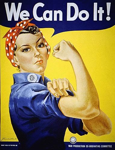
This we can do it poster is a really well known piece of propaganda. It was incredibly successful in persuading people to join up due to its striking colour and bold font that grabs your attention. Also the presence of a woman seems not too threatening and gives no insight of the reality of war, to a man seeing a woman on the poster might seem encouraging.

Propaganda also exists in modern day particularly when it comes to politics and elections. The image above is part of Obama's campaign the image is by Shepard Fairly. Once again you can see the use of simple bold colours and type with non threatening imagery.
Shepard Fairly
Aswell as the Obama poster Fairly has designed some other really great posters.

He is known for being a street artists and he loves mark making techniques and uses a lot of printing to create his designs so they are all made up of blocks of smooth colour rather than being photographic.
Music posters
Live music is always advertised with posters and has to show the style of the music and the vibe of the gig itself without you hearing the music.

The image above is a beautiful example showing music posters need to be really individual to capture peoples attention and often use hand drawn typography to be different to others and show the genre of the band.
Kate Moross

Kate Moross is a designer that I really love and her posters are really eye catching. They always use a large pallet of bright contrasting colour and hand drawn type and image rather than typefaces and photography to give off a fun feel rather than overly serious.
No comments:
Post a Comment