This module has been hugely beneficial to changing the ethics and social political direction of my personal practice. When I think about and fully consider the distribution of my work and the target audience it will real it gives me a new sense of direction. Distribution considerations also massively informed my production methods, working for causes and essentially 'charities' meant I had to explore ways to produce work cheaply and easily. It also informed my decisions in terms of designing additional collateral content; I thought out of the box for ways to produce extra income for the campaigns to benefit the production and free distribution.
I allowed myself to express my passions, interests and personal opinions visually within both briefs and study tasks. Within the first brief I discussed possible options and solutions that were more aesthetically based but decided a more informed outcome was appropriate and different. My interests are becoming increasingly important and integrated within my work. It's clear that having a voice and the guts to express that as a designer is what will make you stand out and take you far as aesthetic application is the last element of importance, it's more about producing design that is informed.
The second brief was an opportunity to develop an expert level of research and knowledge on a topic. I challenged myself to look into transgender issues etc. it's an area that very little information is written about which meant my primary research avenues were of the up most importance. The lack of information and even online discussion on the topic though gave me the freedom to take it in any direction without it already been done before. The idea of producing something new, groundbreaking that could ultimately really help a young teenager in distress about these issues is really rewarding as a designer. Due to the work being important on a personal and emotional level to the target audience being critted throughout was really helpful to me. It gave me a chance to see just how people perceived the work produced to ensure it was appropriate, informative and most importantly didn't offend anyone. My favourite comment was "the illustrations & stickers are quite key stage 3" this was the exact target audience I was aiming my work towards so although it did not directly appeal to her it was a huge reassurance it was appealing to the young teens that needed it.
The increase ability to link bodies of research, exploration and practical visual outcomes is something that will completely change my practice and the type of work I choose to produce. I feel that activism and use the practical application of graphic design to make an impact and change is something I want to stand out and become a driving force for me. I want my graphic design to be an expression of moral, social, political voice that I can use to create impact.
My practice is also expanding in terms of interest in production methods and general output. My interest in traditional print methods, particularly screen printing is growing through each brief and is something I felt was important to include in order to improve my practical skills in the area. Making t-shirts is something I really enjoyed doing as it was completely new to me and could impact many projects and future career prospects by exploring these fields. My growing interest in web design has been influenced by the focus on distribution in this module also. Web design is a brilliant interest and skill to have as its the one tool that can be cheaply and easily spread across the entire world.
My time management during this module has been improved hugely possibly due to the lack of other work on at the same time. It has allowed me to focus and create a diverse range of well considered outcomes throughout. I have hugely enjoyed this module more than most as it has been very personally driven by topics I feel will influence me as a creative throughout my career and this was a brilliant place to start integrating that. The future direction of my design work will be affected by these explorations as I now have experiance with translating the opinions of the 99% (unheard people) into a visual dialogue and representation.
Thursday, 19 May 2016
Wednesday, 18 May 2016
~ Product range distribution - evaluation ~
This brief has been the most free in terms of idea generation and possible routes of exploration of this year. It allowed me to appreciate the large range of issues that affect our daily lives and the importance of helping these causes and fighting for change in a visually impacting way.
I chose gender identity, transgender issues and gender fluidity as the focus of my campaign. This appealed to me as I feel minorities are not well represented in modern day popular culture. During my research I was shocked to find there was only one fully fledged visual campaign surrounding the issue and the sources of information on the topic were badly communicated and confusing. This posed a huge and obvious issue for me to then solve in the form of a physical, visual and digital format.
This brief enlightened me on the benefits and differences between both secondary and primary research particularly when looking into something I initially knew little about. The primary research gave me personal advice straight from the target audience that directly informed my choice of target audience, aesthetic, approach, distribution etc. Secondary on the other hand in this case showed me what was missing and what new things I could offer in terms of a solution to the issues.
A really important element within this brief was the consideration of distribution and making sure it was relevant and appropriate to the context, audience and concept. I felt an initial starting point was web design due to it being largely accessible to all and the lack of online content discussing the matter already out there. In contrast to this I felt the campaign needed to be more directly distributed and targeted at young teenagers in places of education and general popular hang out places. The logical step was to produce a series of print based media outcomes to offer this direct contact. I produced a publication that wasn't just plain information; it combined the teaching of a social & moral lesson with interactive elements. I produced stickers as a part of that making the book more of an educational game for the readers. This needed consideration into production and informed much of the books design.
The fact the campaign is representative of offering help to people means it needed to be mostly provided free of charge. This affected the considerations into production. I effectively chose stock, format and binding methods based upon this factor. My second solution to the funding side of things was to produce conceptual merchandise. I produced t-shirts using the brand identity and illustrations used for the campaign. The first benefit of this being that the t-shirts sold could raise money to provide the posters, stickers and books free of charge to educational establishments. The secondary benefit being that seeing people walking around in t-shirts that boldly discuss the issues and are honest about gender raises more conversation about the topic; in tern normalising it in the public eye. The overall aim of the campaign was to produce an online safe place and community for trans youth and create a generation of people who are understanding of it.
I think my approach and decisions throughout the brief were all well informed by the research into the campaign. I successfully created a body of work that could easily expand into something that iconically faces the issue head on and helps teens suffering with the lack of education and visual resources.
~ Money - evaluation ~
This brief is representative of a new mindset I am beginning to take in my design practice. I have used this brief and module as a whole to explore and express my visual voice to help make change. I produced a body of design work based upon a strong concept and personal view of the financial issues of the UK. This freedom to express my opinion in a way that could educate and influence others has really strengthened the work as a whole.
The communication of social and political issues through graphic design is something becoming more and more prominent within my work. I could of quite easily approached the brief from an aesthetic angle; but I felt it more appropriate and beneficial to develop something deeper and well informed by the brief directly. Thinking conceptually and broadly about the future of the economy in relation to design is something that goes beyond just choosing colour schemes and typefaces; it's expanding my knowledge and ability to stand out among the crowd with my design treatments.
Looking back if I could make any improvements to the final outcome it would be in the final production. I used screen printing and marble methods to produce the final exhibition print. This looked bold and effective but wasn't very far out of my comfort zone. It has made me reflect in a positive way in that in future briefs I will aim to explore new and even bolder print finishes where appropriate.
Alongside the production of physical and digital banknote designs I took it upon myself to expand the horizons and deliverables of the brief. I felt to fully incorporate the complex concept behind it a web design was needed as backup to spread information. It has helped increase my skills in creating collateral for projects and creating coherence between print based and digital media.
I really enjoyed the brief as a whole as it gave me the freedom I needed to think conceptually. It had taught me a lot about how target audience and distribution effect and inform aesthetic and production elements of the design process. It's a much more effective way of producing relevant and well supported bodies of work.


~ License to print money - distribution & web design ~

Distribution is one consideration that has informed many of the decisions within this brief. When thinking of 'standard' money it is distributed to the masses and has to be tight on security methods (uv finishes, embossing etc.) to stop fakes. But my banknote design is not designed to be an alternate currency but instead a commentary on society and issues with social hierarchy; this is something that informed my production and distribution methods.
I felt the most appropriate target audience for my banknotes is young people (university age) just discovering politics fully and being able to vote.

My banknotes as a stand alone design peice don't fully explain their concept and purpose. So I felt the most appropriate way to distribute this additional information was via a website to run alongside it.
Minimal web design research - I want my web design to adapt a minimal and clean look as the content itself is quite dark/heavy. I want the friendly and happy tone of voice expressed within my banknotes to follow through to the website.


Looking at minimal layouts for web design has inspired the way i've decided to produce my own. I want to use large images that immerse the user giving them a full visual experiance. I want the menu, title etc. to be subtle. Using large images will make the amount of serious text look less daunting and more approachable.


I decided to create a minimal amount of wireframes to allow for a fluid web layout that can be changed depending on content. The navigation bar will consist of a slimline tab on the right side of the page - when you click onto it, it expands outwards to reveal the page options.

This mockup shows how the free scroll large image layout of the main homepage works. The social media icons and page title hovers above the rest of the page; the large images below will show the banknotes, exhibition and any other related imagery possibly related to featured articles.


During research into user experiance I found out that simple changes in colour etc. when you click/interact with a button improves and increases click through rate and audience satisfaction. So keeping with the colour scheme of the bank notes i've prototyped it that when you hover/click on a button it turns yellow to inform the user the website is loading and working correctly.

The website follows a simple layout, displaying the visuals of the campaign and offers social media avenues to share it. It would then have information pages explaining the facts and figures surrounding the issue. It would link in articles about the issues we face in terms of the social hierarchy in the UK and ways people can try escape being stuck into a category; such as going to university, improving job prospects, CV writing advice etc.
I titled the website 'the real bank of England'- as it aims to display and discuss the financial issues and reality of economic circumstances. But doing this in a positive tone of voice - portrayed through the colour scheme, aesthetic and comical approach. It would be interesting to take the project further in the inclusion of other illustrators work and reactions to the situation. The website could become an ongoing visual commentary on the UK's financial state.
http://www.bbc.co.uk/news/magazine-22000973 This is an example of the kind of thing that could be embedded into the website - this application calculates what UK class you are and gives you facts and figures relating to it.
~ Product range distribution - distribution ~
The distribution of information and support for transgender and gender fluid teens is very poor and an issue I addressed from the start of this brief. It has gone on to inform each design decision and ultimately my choice of media format to produce. The target audience (young teens) is something that has also informed the distribution methods and places I feel would benefit most from the campaign as a whole.

The website was produced so it could be accessed by all and distributed to the entire world in theory. Posters and other material advertising the site would be distributed more directly.

To ensure the website reaches & is distributed to it's target audience I have produced this simple interactive web advertisement banner. The banner would use cookie technology to target young teens who have been google searching key words such as; transgender, gender fluid, am I trans? etc. It could also appear on popular websites that teens visit such as Facebook, Instagram and Tumblr.

The distribution of the publications, stickers and posters would be much more direct in its approach and visual conversation with the target audience. They would be placed in schools, youth clubs and places considered to be 'hang out zones' for teenagers. Packages containing all of the promotional material (including t-shirts) would also be available to order from the website for individuals who couldn't get a hold of them in their community but still needed the support information.
The t-shirts and other merch such as hats were produced the aid the cost of production and allow the publications to be distributed free of cost. Alongside charity style donations the merchandise would fund the production of all printed media. With increase popularity and exposure the funding could go towards producing a more regular series of publication containing further information, stories, news and other free 'gifts'. The idea of producing such a large range of material is to create familiarity with the brand and the topic as a whole to make society more accepting and informed.
Finally the distribution, target audience and the fact the material is free means it all informed the production methods. I chose simplicity, ease and cost effective methods of producing my publication due to these considerations.
~ Study task 3 - Disobedient Objects North ~
The brief is to create a a5 flyer and a5 ten page concertina booklet promoting an exhibit. The exhibit is called Disobedient Objects North and is all about out-designing authority.
Disobedient Objects North Brief 1


My final image for the leaflet design is the one on the right. It uses the simplest form of breaking the grid by tilting the images; it means the layout is still clean and easily translates visually but is informed by the underlying tone of voice the exhibition has.


The production of the leaflet needed to follow a template a5 concertina book; all images and content were provided within the brief. These are some experimental layouts I produced. I wanted to loosely break the grid, having some images full bleed, others flowing from one page to another and overall a lack of consistency that represents design anarchy.


Disobedient Objects North Brief 1
Background:
This simple layout will ask you to utilise a short amount of body copy, title, date, and location.
The minimal amount of text allows for the simple use of single imagery and the type to serve
as the main visual elements.
The minimal amount of text allows for the simple use of single imagery and the type to serve
as the main visual elements.
Brief:
You are asked to produce a simplistic flyer design for a 'Disobedient Objects North' Exhibition
at the People's History Museum (www.phm.org.uk) using the instructions below.
at the People's History Museum (www.phm.org.uk) using the instructions below.
Specifications:
Format: A5 – Portrait
Title: Disobedient Objects North
Sub-Title: In Association with the V&A
Date: August 3, 2015 - August 29, 2015
Location: People's History Museum, Manchester.
Contacts:
www.phm.org.uk
www.vam.ac.uk
Image: Single exhibit-based image, People's History Museum logo, V&A logo,
Use of two colours only: Black and white
(Use embedded InDesign file and follow grid.)
Save as PDF file.


I wanted to create a design that visually translates the idea of disobedience and anarchy. This would involve creating a grid and certain amount of balance with the purpose of wanting to break it. I decided to create a title logo for the exhibition that represented a tight grid with clear boundaries. I produced this type logo and kerned the typography so each word met the ruler guidelines perfectly. I used Futura Regular as this typeface is geometrically designed and has a natural sense of balance and perfect form; the contrast of this with the overall layout and format of the design as a whole will give it impact.


Using the header logo and selected images (singular specified by the brief), I created variations of leaflet using the concept of breaking the rules and design anarchy. I did this by offsetting images, type and playing around with fluidity of the type in Photoshop.


The production of the leaflet needed to follow a template a5 concertina book; all images and content were provided within the brief. These are some experimental layouts I produced. I wanted to loosely break the grid, having some images full bleed, others flowing from one page to another and overall a lack of consistency that represents design anarchy.

For further inspiration for my final layout design I looked into the designs and aesthetic of punk zines created using basic cut, stick and photocopy methods. They 100% translate anarchy and activism which is the content of the exhibition and the overall tone of voice my leaflet needs to have.


This is my final layout design for the concertina leaflet. I decided to take a cut and stick approach to the design, overlaying images and type. This aesthetic is informed by the design style of punk zines which is relevant to the artwork and overall theme of the exhibition its-self. In terms of production of this I would use a lazer-printer or photocopier also alike the punk zine movement to further portray this aspect/concept. The leaflet would be cheap and easy to produce and distribute whilst perfectly portraying the exhibition.
Tuesday, 17 May 2016
~ Study task 4 - vote - final production ~
Alongside my provocative guerrilla advertising style stickers Florence and Amelia produced further collateral designs for the campaign.


Florence designed this double sided leaflet design. The design follows the overall aesthetic of the campaign for brand consistency. It appeals to the target audience by cleverly saying 'if you can vote for a tv show you can vote for politics' - it's intelligently making a point about the ease of voting. The leaflet would be distributed free in places that people are likely to interact with such as public transport, places of education and work.


Lastly Amelia produced a website design mockup for the campaign that documents all the movements and material within the campaign, further information, places to buy a package of signage and stickers for people passionate about furthering the campaign itself.
~ License to print money - Final print ~
Within the requirements of the brief we needed to use at least 2 colours/finishes to create the final outcome design.


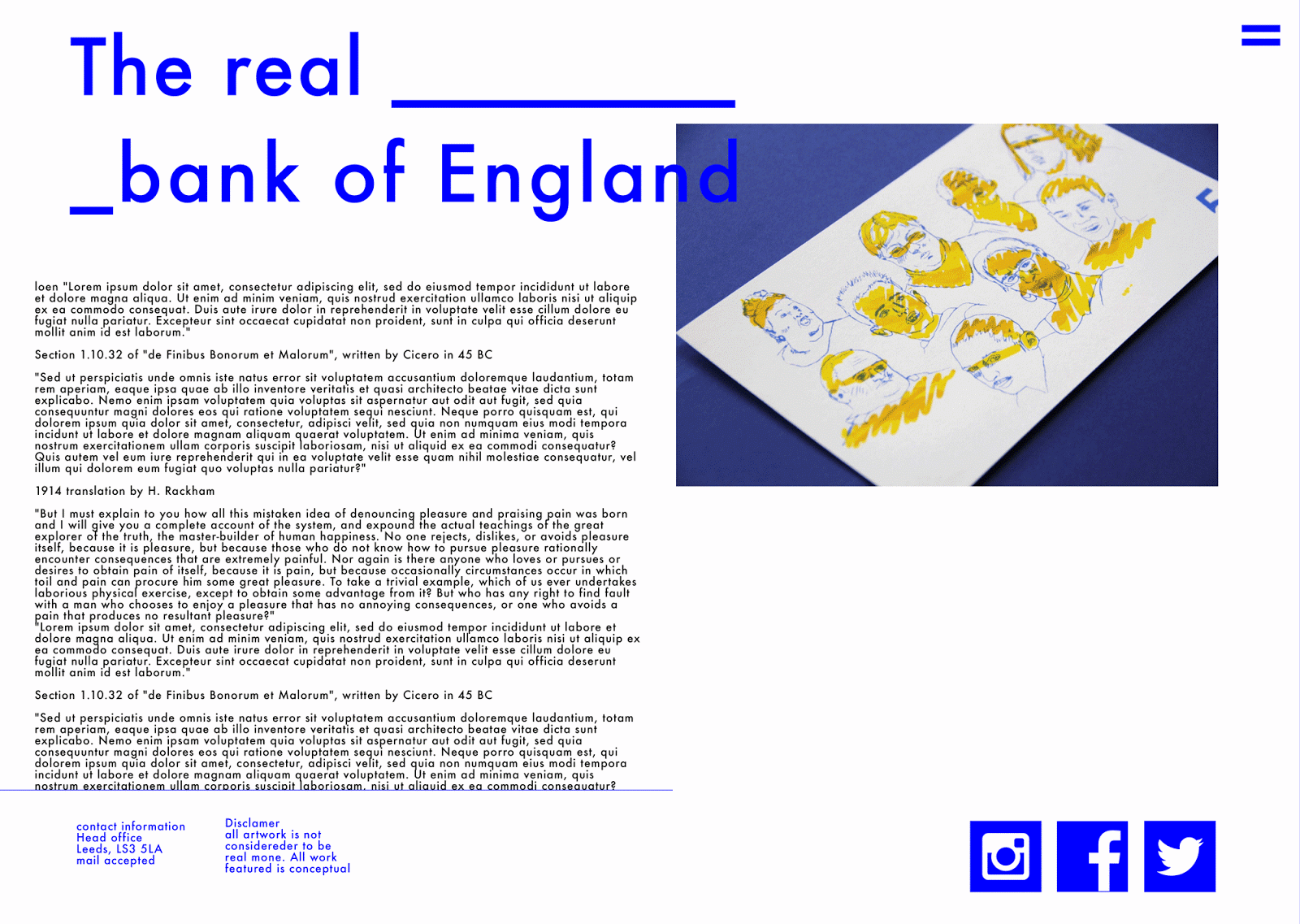
I felt the illustrative style of the banknotes meant simplicity in choosing 2 colours was enough to express the friendly and comical feeling I wanted to portray; rather than using finishes such as foiling which I felt would just distract from the overall concept.
I decided to screen print the final notes as it allows you to mix colour by eye, use brighter pigments than digital printing allows and create marble effects within the print.
I used a solid blue for the outline to keep the design concise and highly visible. For the background I used a marble flood screen printing technique where you mix together two colours of ink to create patterns within the print. This adds another dimension to the print and also makes each one completely individual from one and other. I used yellow and orange for a subtle and effective background colour that instantly grabs your attention; then on a closer look the marble tells the audience it is in fact screen printed rather than digitally printed; it gives people more appreciation of the hand crafted element relating to the fact the concept is personal to me and my opinions on the social hierarchy.
Subscribe to:
Comments (Atom)