
Distribution is one consideration that has informed many of the decisions within this brief. When thinking of 'standard' money it is distributed to the masses and has to be tight on security methods (uv finishes, embossing etc.) to stop fakes. But my banknote design is not designed to be an alternate currency but instead a commentary on society and issues with social hierarchy; this is something that informed my production and distribution methods.
I felt the most appropriate target audience for my banknotes is young people (university age) just discovering politics fully and being able to vote.

My banknotes as a stand alone design peice don't fully explain their concept and purpose. So I felt the most appropriate way to distribute this additional information was via a website to run alongside it.
Minimal web design research - I want my web design to adapt a minimal and clean look as the content itself is quite dark/heavy. I want the friendly and happy tone of voice expressed within my banknotes to follow through to the website.


Looking at minimal layouts for web design has inspired the way i've decided to produce my own. I want to use large images that immerse the user giving them a full visual experiance. I want the menu, title etc. to be subtle. Using large images will make the amount of serious text look less daunting and more approachable.


I decided to create a minimal amount of wireframes to allow for a fluid web layout that can be changed depending on content. The navigation bar will consist of a slimline tab on the right side of the page - when you click onto it, it expands outwards to reveal the page options.

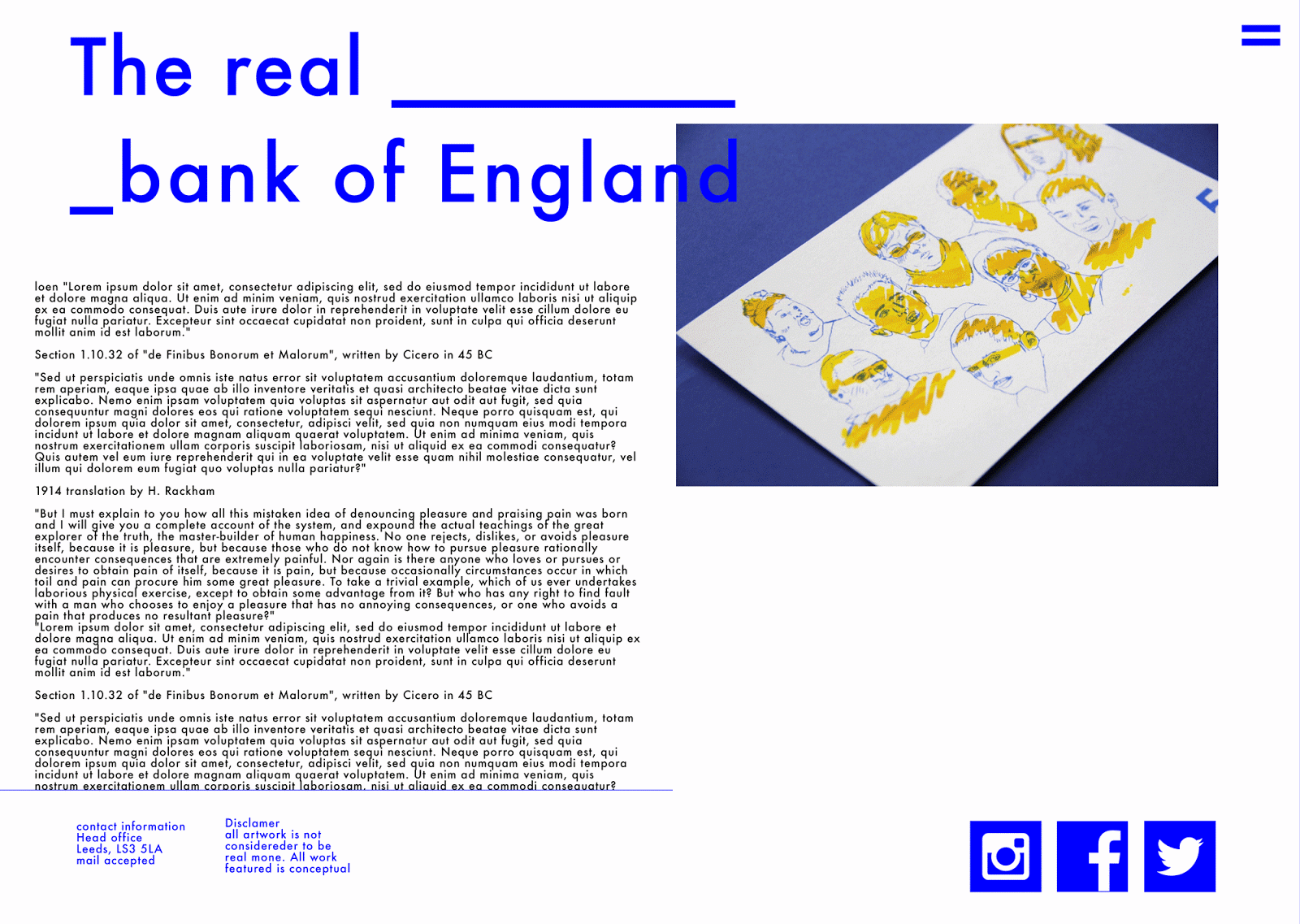
This mockup shows how the free scroll large image layout of the main homepage works. The social media icons and page title hovers above the rest of the page; the large images below will show the banknotes, exhibition and any other related imagery possibly related to featured articles.


During research into user experiance I found out that simple changes in colour etc. when you click/interact with a button improves and increases click through rate and audience satisfaction. So keeping with the colour scheme of the bank notes i've prototyped it that when you hover/click on a button it turns yellow to inform the user the website is loading and working correctly.

The website follows a simple layout, displaying the visuals of the campaign and offers social media avenues to share it. It would then have information pages explaining the facts and figures surrounding the issue. It would link in articles about the issues we face in terms of the social hierarchy in the UK and ways people can try escape being stuck into a category; such as going to university, improving job prospects, CV writing advice etc.
I titled the website 'the real bank of England'- as it aims to display and discuss the financial issues and reality of economic circumstances. But doing this in a positive tone of voice - portrayed through the colour scheme, aesthetic and comical approach. It would be interesting to take the project further in the inclusion of other illustrators work and reactions to the situation. The website could become an ongoing visual commentary on the UK's financial state.
http://www.bbc.co.uk/news/magazine-22000973 This is an example of the kind of thing that could be embedded into the website - this application calculates what UK class you are and gives you facts and figures relating to it.
No comments:
Post a Comment