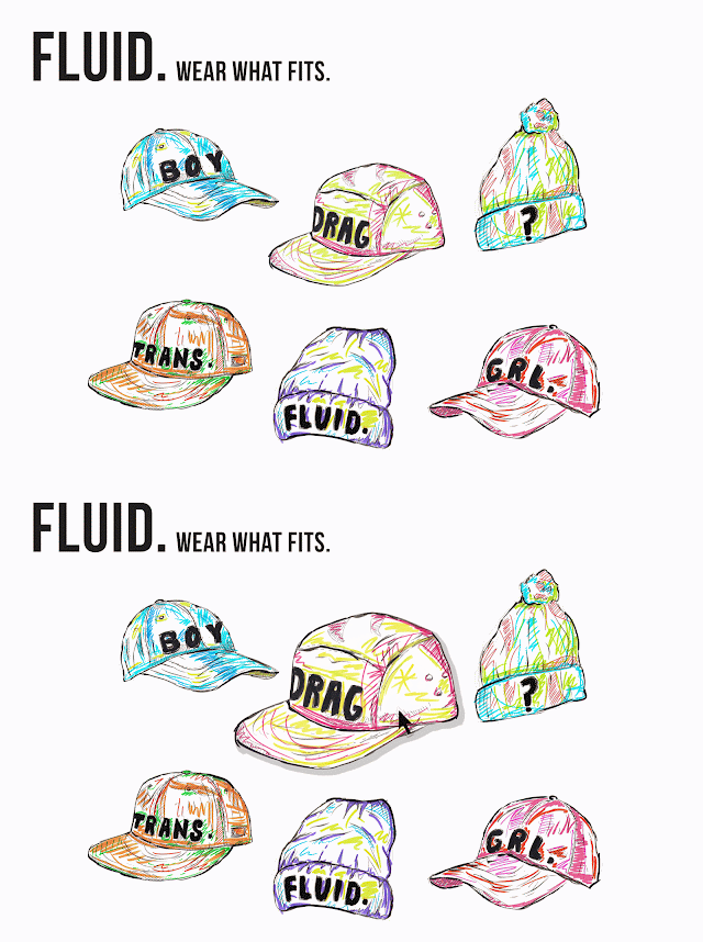
I began using the web design platform wix to create a mockup of the campaign website.
I decided my idea so far seemed over-complicated. The subject in itself is difficult to understand as theres a lot of blurred boundaries and little information out there. So I decided to develop upon the hat illustrations I did and produce my full concept around this. Using the tagline 'wear what fits' as in you can choose the pro-nouns you feel fits you best. The website will aim to clearly tell you about each pro-noun/gender definition and offer specific support on each category.
The main distinctions of gender are male, female, transgender, gender fluid, drag artist and questioning. I will illustrate a hat for each one.
With my simplification of the concept I decided to also change the typeface. I chose Bebas Neue as it's very similar to the type I illustrated onto the hats. Above shows a gif of the homepage/main page for the site; showing how the website reacts to a hover (the image will enlarge and a drop shadow appears. My research into user experiance tells me that small changes like this as a mouse/person interacts with a website increases click through rate as it allows the user to know the website is actually working.
I've added in links to a Forum page to allow teens and other visitors of the site to talk to others and discuss issues with each other; the website then becomes a safe place for people in similar situations to talk. I also added a links page that could link to helpful websites, blogs and articles. And lastly a news page that would livestream relevant news on the topic of gender; you could subscribe to this like a blog via email and rss.
This example shows the design for the boy definition page.
The simplicity of the design is successfull as the main issue I addressed with looking at sources for information on gender is that it's too confusing with no definitive definitions. It also works well for the young target audience who don't want to be overloaded and scared by masses of information.
For the design of forum was something I needed to continue the minimal theme onto. I researched into similar/current transgender forums to see the issues they had in design and simplicity of navigation. I noticed the overcrowding of small type and unappealing colours didn't make them look like bright and friendly places. I decided the grey and cream colours had a huge effect on the overall feeling of it and that my design needed to be as clean and simple as possible to ensure it looked more appealing than its competitors.
These are my prototype layouts for the forum pages of the website. Ive kept things as simple as possible; consistently using the same typefaces and pt sizes to ensure balance. I've used Futura regular as the secondary typeface as it's easily legible and a clean friendly typeface. The forum allows people to ask personal questions and begin conversation with teens going through similar life changes to one another. It encourages networking and friendship. I have used a light blue colour swatched from the illustrations as its a positive and appealing colour, it highlights what page the user is currently on within the website and also highlights the elements that you can click on for more information - another thing I learnt is important whilst researching user experiance.
Alongside the web platform I also want to create promotional stickers and other possible forms of promotion.


No comments:
Post a Comment