In terms of collateral production I decided to do some research into whats already available in regards to the topic.

Example of magazine spreads discussing gender - Galileu Mag


Art and photography style publication - HEN

https://www.behance.net/gallery/23483453/THE-GENDERBREAD-KIT
The gender-bread kit - allows young people to make their own gingerbread with add ons to help understand gender and its fluidity.

Hugo - the dog with serious cattitude - A book aimed at children using the analogy of a dog wanting to be a cat for transgender.


One possible extension of the website could be to make actual hats with the pro-noun definitions on. This would help fund the project but possibly not be as socially beneficial or teach people a lot about the issue.
My alternate idea is to produce a set of stickers and corresponding publication that serves as an educational tool/makes a point about the issue.
Using the hat illustrations as stickers I want to produce a publication that initially encourages you to use the hats to label people due to their appearance. The end page of the book will then inform you that labelling people by first judgement is wrong and that you should presume everyone is fluid rather than distinctly male or female and encourage people to be open and ask others about pronouns. It's a tool that would introduce gender and help young people question and understand it more clearly without false judgement.


I chose to crop each photo to square format so they can sit within strict guidelines without overlapping & causing issues such as the photos hitting the centre fold of the publication. I ensured the head of each individual is mostly exposed so the hat stickers can be applied effectively. The decision to make the images gray scale was informed by the bright eye catching hat illustrations themselves; once applied I want the hats to really pop and be the most memorable part of the task/experiance.
I chose to keep each spread very minimal by just including two images and their appropriate name tags. I felt any additional information would distract from the interactive element of the book. The text and description is at the back of the book to allow readers to reflect on the experiance.
The publication is A5 and will be printed on a thin white stock; these decisions are informed by the distribution of the final publication. Due to the target audience these would be distributed in schools and youth clubs etc. to be specifically seen by the young teen audience. Using this format and stock will keep costs low and make distribution easy. It will be staple saddle stitch bound; this is the cheapest binding method and allows the stickers (can only be printed one sided) to be bound into the middle and removed with ease.
The type on the back page reads
"This guide will allow you to learn & consider gender on a scale of fluidity and variation rather than categorising people as either male or female.
This is a gentle introduction to the correct use of pronouns and self identification. The stickers included in the middle of the book can be used to try and identify the charecters within; some may seem obvious and others more challenging; but use your instinct."
Ruby Rose, Miley Cyrus & Ezra Miller - Identify as gender fluid
Laverne Cox & Jamie Clayton - Both transgender MTF
Alan Cumming - Known for his public LGBTQ activism
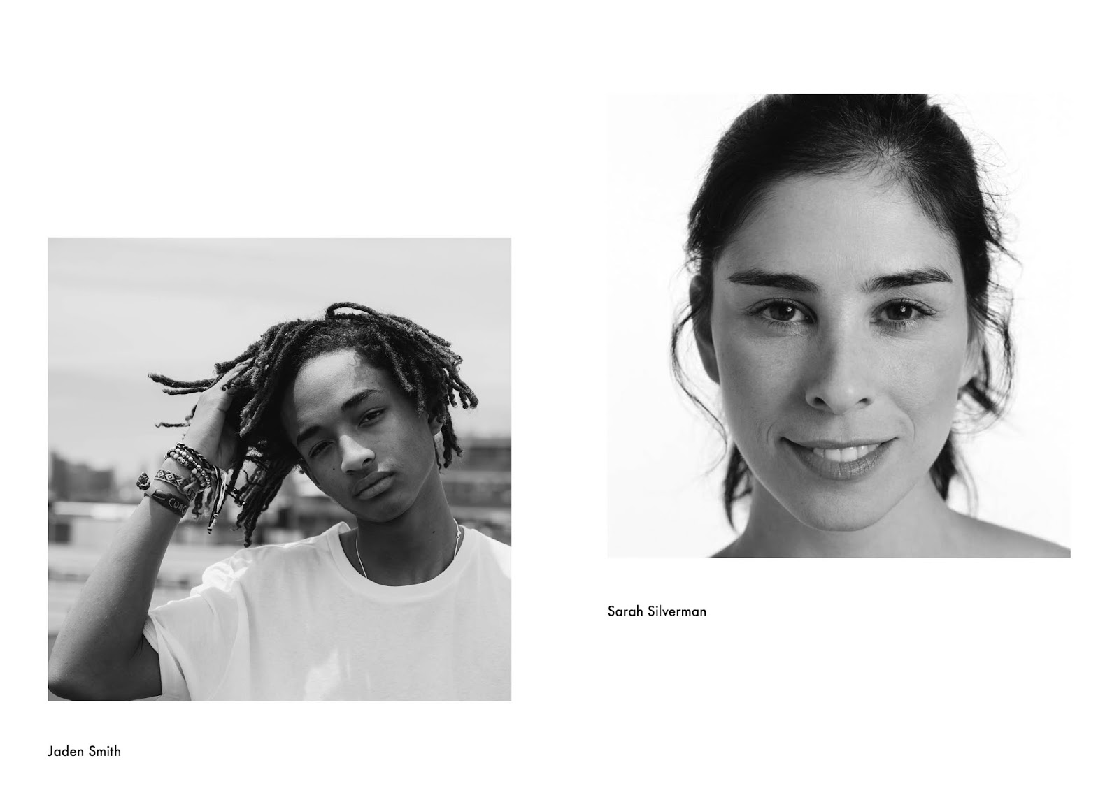
Jaden Smith - Known for his bold 'genderless'/'gender bending' fashion choices
Sarah Silverman - tweeted "Merry christmas, Jesus was genderfluid" that sparked a lot of online debate in which she defended the cause.
Eddie Redmayne - Recently starred as the lead role in a transgender themed film 'The Danish Girl'
Jenny Lewis - Uses her music to try redefine and breakdown the boundaries of gender
I chose these people as many to not fit into immediate labels and would argue the point that labels bind society in negative ways. It allows the reader to further research the people themselves and hopefully cause them to really think about their answers and reasoning for such. It creates a design that consistently provokes thought and impact for the cause.
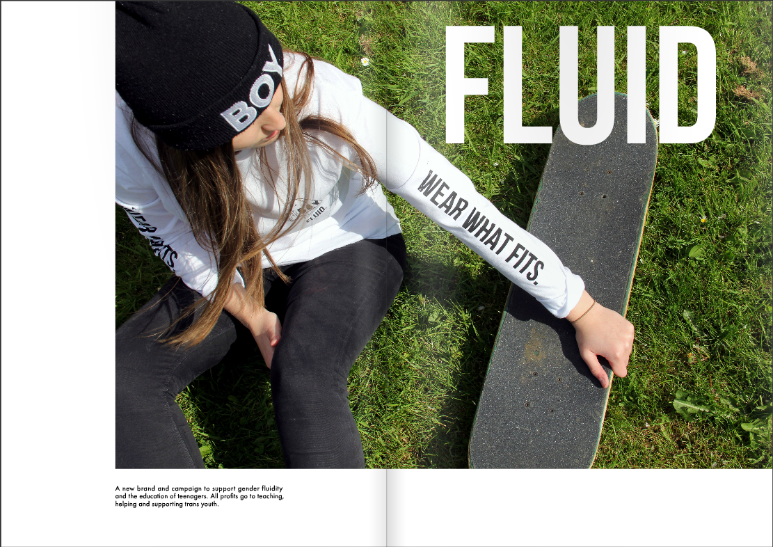
Alongside the publication I have also decided to produce t-shirts; of which the profits could go towards improving the campaign, making free booklets, leaflets etc. I want the t-shirts to take on a skate aesthetic to appeal to the young target audience (they need to look 'cool' rather than purely educational.

The t-shirts would be available in all 6 categories of pro-noun illustrated on the website - each using their hat as the main icon/badge on the t-shirt. But for the purpose of producing a prototype for the brief I will be using 'boy'. I used Illustrator to vector and simplify the illustration in Black & white in order for it to be screen printed.

This is the initial mock up for the t-shirt design. I have used the icon design and the campaigns logotype (fluid) as a badge on the front. I have also included the tagline running along the sleeves of the t-shirt. The t-shirts will be screen printed. The t-shirts would effectively advertise the campaign as a whole as people could share images of themselves in them linking to it; they would also raise money to fund the production of the publication which would be FREE and distributed in schools.

experimental look book design


Alongside the production of the t-shirts I have created a mock-up digital lookbook. Online this promotes and displays them in a professional and appealing way to the target audience. A physical version of the lookbook could also be produced using all products to send to potential stockists of the merchandise & supporters/donators to the campaign.
Lastly I felt posters were needed due to the overall distribution of the campaign being via publications & web - people need to know about it initially to interact and get involved.


The posters follow the overall brand identity and aesthetic of the campaign. I used bold type to display thought provoking captions alongside the illustrations; additional information being the website address to allow people who are affected and interested to explore further. It's a simple, bold and effective way of letting teenagers who are affected by gender issues to know their is help and comfort out their without directly picking individuals out. Just like the publication/stickerbook the posters would be distributed for free and encourage schools to hang them around for all to see.
No comments:
Post a Comment