Font- A collection of letters, numbers and punctuation and other symbols used to set text. Although font and typeface are words used interchangeable. But a font is what you use and a typeface is what you see and the aesthetics.
Lettering- Illustrations of letters, words or phrases. Not a full alphabet but just something individual. The letters probably wouldn't work when rearranged or out of context as they are designed for a specific reason.

A large x height makes a typeface look larger, if you were to compare two fonts at the same pt size the one with the bigger x height will look larger.

We looked at the difference between serif and sans serif fonts and briefly looked at different types of serif. Serifs are the added decorative parts on the end of strokes. Instead of serifs, sans serif fonts have terminals.

Italics are narrower versions of the original font, they are slanted and always serif fonts. Italics are usually used for emphasis and quotes. Italics are completely newly designed fonts not just tilted digitally.

Oblique is pretty much the sans serif version of Italics visually but is a completely different process. They are slanted versions of the original font but they are sheered mechanically and then slightly adjusted rather than being newly designed fonts from scratch.

Diacritics are variations of letters that changes the sound of the letter as it can't be achieved just by using the regular alphabet.

Uppercase is the capitals of an alphabet. The name comes from the fact these letters are kept in the upper part of a type case when working with physical printing type.
Lowercase is the other letters than fit within the x height generally other than ascenders and descenders.
Small caps are capital letters made to fit within the x height. They are individually made as a new typeface and are bolder than if you were to just shrink capitals.

Superscript are letters/numbers placed above the normal line of type and smaller. A good example being th and nd.

Subscript are letters/numbers placed below the normal line of type. H2O and other elements are good examples of this.

An underline is often used for titles and is a line placed under the baseline.
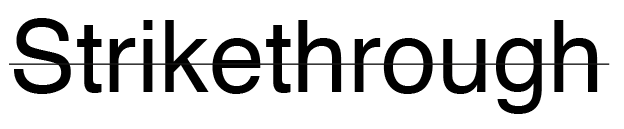
A strikethrough is a line through the middle of type. Its used to show mistakes and parts to delete often for draft purposes. But strikethrough has become a questionable trend in typography recently.
Kerning refers to the process of adding or subtracting space between specific letters or characters. Tracking refers to the process of loosening or tightening a block of text.
Kerning is generally used for display type and tracking is used for body text. Tracking is good for getting rid of orphans.
Leading is the space between the two baselines of two lines of text.
Pt size is a typographic measurement and corresponds to 1/12 of a pica.
A Pica is also a typographic measurement equal to 1/72nd of a foot or 1/6th of an inch.

We also went over the anatomy of type and specific parts of letterforms. This is a great image that shows quite a lot of them.
A colophon is a paragraph that tells you the typefaces used within a publication and the specifications such as the date of printing and where it was printed.
A great quote I look from this was "You could put a cross bar in a letter G if you thought it was appropriate". Its telling you the anatomy can apply to any letter if you make it so.
No comments:
Post a Comment