This module has been really valuable in learning how industry standard design needs to be produced and the possible avenues live briefs can be approached from.
The first brief - individual practice introduced me to how live competition briefs can open a whole new world when it comes to self promotion and self confidence with work. Unfortunately I didn't get a place in secret 7 but since seeing the winners I understand the style/aesthetic they look for and i'm more confident about entering next year. I am definitely going to enter more competitions and try get my work into exhibitions in the future as i'm becoming more and more inclined to talk to people in the design world and really put myself out there. Im currently trying to really place myself within the Leeds local arts community and hope competitions like this brief can help me branch out. The brief also gave me a great chance to take full creative and conceptual control without restrictions of a strict brief which was a good chance for my imagination to be free.
The second brief - this was my favourite from this module due to the screen printing method used to produce the final piece. A lot of the briefs this year have required digital outcomes so i've missed out on a lot of physical experimentation. I unknowingly set myself a huge challenge with my screenprints as the registration of the colour split was really tricky. But finally being successful in perfectly printing my cover despite this gave me real confidence and experience in printmaking. The feeling of completion and knowing that my work will be displayed in an exhibition is really invigorating and has now given me the confidence to put myself forward for another exhibition (&TuttiFrutti).
The third brief - this was my least favourite of the 4 briefs but still really valuable. I found it difficult working in a group as I didn't always feel comfortable giving my opinion and i;ve been so use to having full control over my work over the past year. But it gave me a more realistic view of how working for a company would be like. Despite a few mixed opinions though our final product was really effective and well informed and I was really happy to present it in front of the second years and tutors. It also gave me confidence in my GIF making and that seems like a really valuable thing for me to explore further.
The fourth brief - this brief was a chance to really reflect on the things i've learnt over the past year, I was surprised how much i've changed in the way I think about approaching briefs. Particularly how informed my outcomes have become rather than looking at creating something just for attractiveness and aesthetic. I then had the chance to try inform the freshers of this in a creative way. I wanted a way of escaping my laptop for a brief and using my hands instead as this is the direction i'm looking to move further into next year.
In conclusion this module has covered 4 aspects of design practice I was mostly new to before now. I am beginning to understand my own practice much clearer due to this and mt direction is becoming clearer.
Thursday, 30 April 2015
Exhibition branding - final evaluation
This brief was a real learning curve for me as its one of the only collaborative projects we have done so far. Managing time during this brief was much harder than the others as everyones schedules were different and we often didn't have a full group. We managed to get work through it even if it meant our workloads doubling at points. I personally didn't like having to rely on other people and think if the communication within the group was better we would of had more success.
Despite the small problem of time the brief taught me a lot about having confidence in my ideas. Me and Charlie were the only people actually in the studio when producing the initial ideas for the branding. I was worried not having the full group would affect us negatively but the two of us had some brilliant ones and managed to come up with a really solid plan including the name "perspective", the concept and the idea of using anamorphic type. Another area that helped build my confidence was when creating the GIF, I wanted to use my skills in this area to make our project individual and interactive. The group was initially unsure of how useful it would be for our pitch but I told them about how it could be used for promotion and convinced them to include it. Amazingly the feedback about the GIF after the pitch was really positive and it was even said it would be something that could be built on. I will in future push more of my ideas further despite other people maybe being unsure of them as I trust in my instincts of what will be appealing.
This brief was interesting as unlike others the outcomes ranged over all aspects (logo, gif, invites, social media etc). It was a great chance to try making each aspect correlate with each other which was quite new to me.
I think working in a group was really good for learning how to communicate better. But I think i'd prefer to choose who I worked with when collaborating in future as there was a few disagreements and confusions on style choices.
Reflective practice - printing

I had the final 3 posters printed on satin stock at a3. I felt this format would allow the type size (body copy) to be legible from quite a distance so people wouldn’t just disregard it. The stock choice was so the black of the ink would be full contrast (not grey) and the colours in the photography would stay bold as ive found in the past this can be lost a little on matte paper. The final posters really pop and are in your face and ‘shocking’ which is the exact outcome I hoped for.
Tuesday, 28 April 2015
Reflective practice - final


My 3rd and last why is made up out of bottle caps to once again represent one of my vices and the concept of turning negative into positive.
Once I had all 3 I was unsure how to lay them all out effectively so that the titles and the body copy both stand out as both are equally as important in showing the concept.

This was one layout experiment. I had to reduce the width of my column for this one and it only has 4 or 5 words per line which I didn't like. I wanted to demonstrate the most effective and legible layout I could to inspire and inform the freshers so this layout didn't seem appropriate.

Secondly I tried typesetting the body copy around the title images so they interacted with each other. Instead of being effective as I had hoped it just overcrouded the layout and took away the simplicity.

I also tried the thinner paragraph places differently but still didn't think having it so thin demonstrated what I have learnt over the past year well enough.

My next experiment I had the titles running across the top and split up the body copy into three. I thought this was the most effective so far as your eye then naturally reads the type in the right order.
I did a mini crit of this new layout with people in the class. People liked the separation of the body copy and said it brought everything together nicely. But they said for more impact I should split it into 3 posters also that could be hung next to each other as they would seem like much bolder statements when separated.


These are my 3 final posters, designed to be displayed in a row next to each other for maximum impact. Splitting up the type means I can achieve the most legible number of words per line and have the type a large pt size so you're more likely to read it than when it was smaller. The hierarchy of the design means you are drawn in from afar by the unusual title type then encouraged to read the body copy which helps you understand the concept and will inform the first years about how important asking 'why' really is.
Monday, 27 April 2015
Exhibition branding presentaton
This our final pitch for the exhibition branding. We created a script for this in advance and printed it on the back of card with our logo on to be more like a professional design company pitching to clients.


Florence: MORNING/AFTERNOON. We are here to present Perspective. An exhibition at Leeds Library for first and second year graphic design students.
Perspective is defined as:
the art of representing three-dimensional objects on a two-dimensional surface so as to give the right impression of their height, width, depth, and position in relation to each other.
As well as a view or prospect. Point of view.
Charlie: Target audience is something that we found paramount in this exhibition. We are appealing to students as well as industry. We wanted the exhibition to focus on selling Leeds College of Art as well its students as up and coming designers. We also wanted it to showcase the skills of this course in the best way possible. The target audience has informed the use of a sans serif type and minimal colour palette, this appeals wider audience as it is easily understood.
Izzie: Our concept is perspective. That each individual on the course has taken a different twist on a book cover.
This idea of perspective extended its self into the idea of 3D. One of our points of inspiration was the Sagmeister cover ‘Made you look’. We created our invites on this idea of seeing two things differently and the perspective in which it can be viewed.
Katie: Colour scheme was simply from the idea of 3D, we chose red, blue, black and white. This minimal and simple colour scheme meant that we wouldn’t clash with any of the prints and would keep a clean canvas for exhibitioning the work. It also relates back to 3D and how you perceive things.
Chris: Typefaces we chose are Akzidenz Grotesk and future condensed. They are simple and clean sans serif fonts, so suit the colour separation. They are easily legible and standout on posters. Can also be used for both body copy and display type.
This is a variation of the invite we later simplified to tie in more with the rest of the minimal style design.
(hand out invite)
Charlie: These are the invites that we designed. They are interactive, so you can see perspective with acetate. It also means the audience can take control of the invite. We wanted to make it different to a normal invite so it is the sort of piece a person would share on their social media giving ‘hype’ to the exhibition.
(show poster and explain)
Izzie: Posters have been designed to put up around the university and Leeds Library. These posters have been made bold, yet simple. This is so they standout against other posters. Once again, keeping in with the key colour theme and use of only simple shapes as well the colour separation on the circle. It has also been made in a vector so the size is full adjustable.
Chris: The social media aspect of our design was created to boost the reach of the exhibition, attracting a wider audience than possible with simply word of mouth and posters. The pages can also be used to document the exhibition to attract people that would want to see examples of the work, and simply for people that aren’t able to visit the gallery (distance etc.) to get an insight into the exhibition. The best form of advertising for a company is simply word of mouth, and social media is a great way to engage on that level.
Izzie: Our welcome sign will be made using the vinyl cutter in digital print, this makes the type more interactive within the exhibitions environment and avoids any lack in saturation you might get when printing a sign. We will also create anamorphic circles around the room to engage with the viewers and relate to the concept of perspective, we also plan to make anamorphic way finding (arrows) on the stairs ect.
Katie: The posters will be displayed in 3’s , this format will be reflected in the book, the format means that all posters can be displayed clearly. It will also ensure that none are too far below eye line, nor too high. All posters will be hung off clear wire from the celling and have bulldog clips attached at the top of the work, this is to ensure that all work comes out of the exhibition in the same condition.
Name tags will be displayed to the right bottom hand of the work, and will be business card sized.
Florence: this is the front and back cover for the leaflet we are proposing. Inside the first two pages will be about the exhibition and the course. Second spread will be poster designs from students. This format will be repeated for 8 more double page spreads. This is so visitors of the exhibition can go home with a list of details from all of the exhibitors. We are also proposing for a lower budget, that we would simply would exclude these 8 double pages. The designers details page will include name, first/second year and what ever contact information they wish to be shown. Designers may opt out of having any contact details shown. Last double page spreads is simply a thank you to Leeds Library for having us as well as information about the location.
Izzie- We decided to create a gif, this could be displayed on projectors within the exhibition and on the tvs at uni and social media for promotion of it. It's bringing an unusual and interactive element into the branding which will stand out from most. The idea of the glitch is partly to represent peoples brainwaves and perspectives going off in different angles and we also thought its quite representative of the screen printing method as you often get little glitches and problems but it adds to the charm.
These are the three tiers of price plan we are suggesting, the first our cheapest has only 500 prints of a 1 double sided page leaflet. And everything we feel is necessity for the exhibition.
Our second price plan is for the more book like leaflet, we are also printing 1000 copies of it. Once again with the necessities
Our last and most expensive price plan simply has more vinyl stickering and same amount of books.
We have placed a folder on the desktop that involves the excel file, which includes all of the price plans and can be altered if you wish.
Thankyou and Any questions.
Reflective practice - brief writing
For this brief we had to taylor and change the deliverables and requirements written into our own brief that we had to create a design treatment for. This is the brief I have written.
Brief
As a fresher its a shock having a large workload and being unsure about how to get a good grade and produce effective designs. At first most tend to play it safe and design for aesthetic and purely looks. The aim of this brief is to inform the freshers about the importance of informed design decisions. Also to try and inspire them to step out of their comfort zones and show how taking a negative to turn into a positive can be really effective. Use the skills learnt throughout the first year (example typesetting) to show the importance of learning things like this thoroughly themselves. Try and think out of the box, demonstrate unusual use of media to show that jumping straight onto a mac/digital designs isn't always the best option.
Aim
To produce a piece of graphic design that tells the freshers to ask themselves questions that encourage more informed and adventurous graphic design.
Target audience
Next years 1st year graphic design students
Deliverables
Blog posts, design boards, final design treatment
Speaking from experiance - final crit OUGD406

Prior to the final crit I did a second similar design but using another of my vices that has got me through the stress this year, coffee. This time I chose to use a sans serif typeface, I think using a variation of type styles will look more appealing and will encourage and inspire the freshers to not just stick to one and be more adventurous instead.
I presented my two designs in the final crit and explained the concept behind them. The comments I got from this crit were
- Good that if people are scared to try new things this inspires them to do more hands on design
- The image is important
- You could try incorporate the message into the environment somehow
- Add coffee stains? make it more obvious what it is as its not at the moment
- Make the concept more obvious
- Clear aim
- Worded really well - paragraph articulates why you've used negative things
- Maybe separate the type from the poster as at the moment its too small and doesn't really stand out which could confuse the purpose of them.
- You could overlay the type or just create a different layout
- Presents our addictions as students and the idea these 'bad' things can be taken advantage of and made positive
- Gets people to experiment
- The use of unusual and negative material in an attractive way has a shock factor that makes it interesting
I took in all these opinions and it was really helpful in making my idea work together. The main thing I found from the crit was that the message wasn't clear enough until you read the body type so this needed to be bigger for more impact on the design. Because my paragraph starts with 'why why why' I have decided to make another 'why' and have these all on one poster running down the left side then have the paragraph much larger than it is now running down the other side. Having a much more straight to the point design will make the concept and overall message so much clearer. I will use another of my vices to create the final part of the design, alcohol. To show this I will create type from bottle caps.
This is my adjusted design so far, I have enlarged the type so its just as impactful as the large images. I have left room for the third and final image at the bottom. I have also added in some coffee stains to make it more obvious that the material used is coffee strengthening the concept. Once this design is finished I will do another crit with people to see if the new layout makes the impact stronger and the concept and informative nature of the design more relevant and obvious.
Saturday, 25 April 2015
Designing for Speaking from experience OUGD406
My final idea for this brief was to create an informative poster about the importance of asking why? and why not? at every opportunity possible on this course. I believe by constantly asking myself this I have been able to make my designs as informed as possible as a pose to just designing for the aesthetic or to be attractive. I wanted to really drill in this concept of not designing for attraction as the main objective by making my poster out of something considered negative and disgusting. For inspiration I thought about some of the negative things i've turned to as stress relief this year...


- sex
- alcohol
- coffee
- smoking
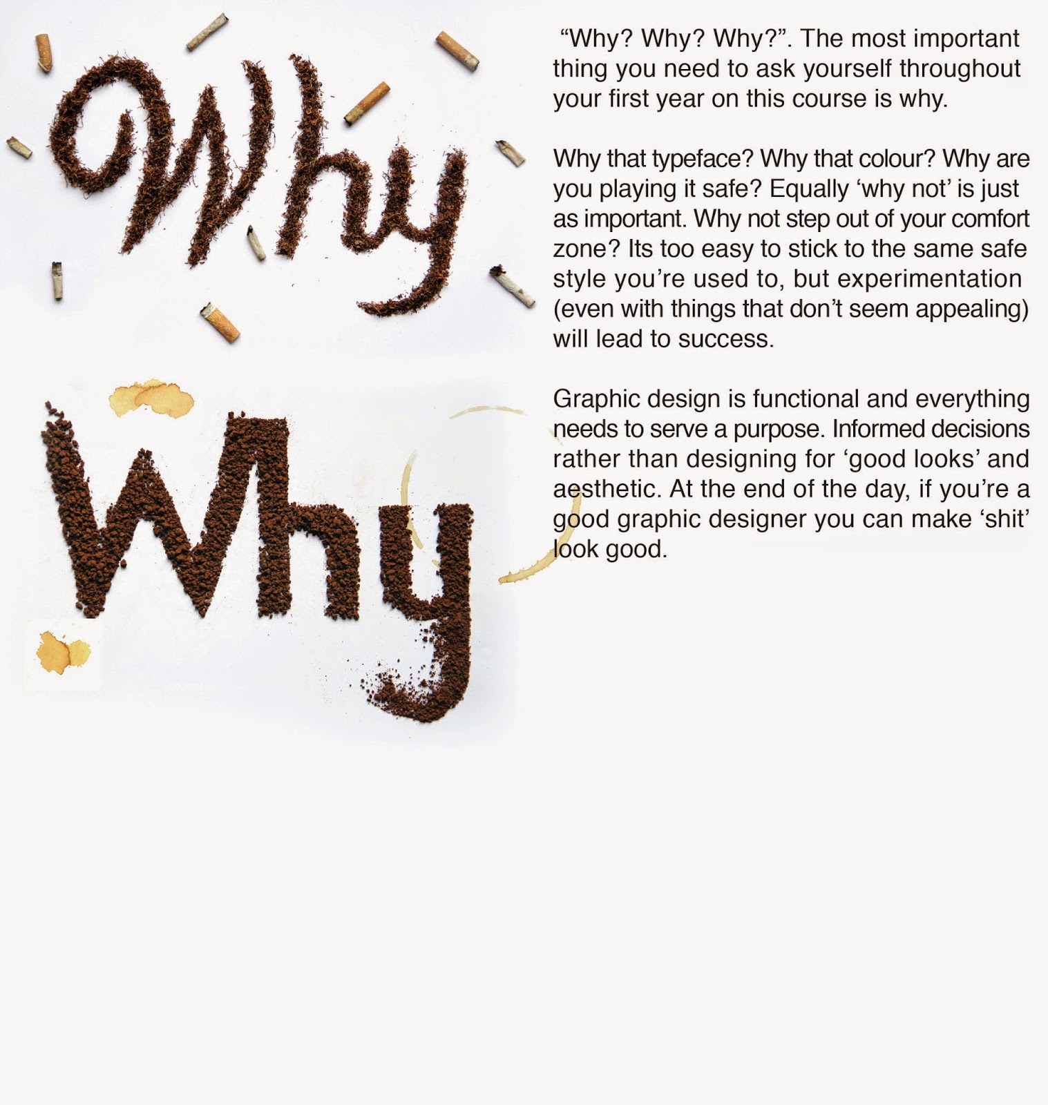
I then narrowed down this idea to thinking smoking was the most appropriate, its considered the most 'unhealthy' and dirty thing from my list of possibilities. I initially began collecting tab ends (gross I know) but realised the more effective way of doing this would be to create my type out of rolling tobacco instead and it would still have the same effect and concept behind it.
I decided to use a script typeface (I had previously sketched out) to add a sickly sweet feeling to the design, I wanted it to contrast the media used and negativity of it.
I wanted to do something physical like this for the production of this final brief to show next years freshers that its much more fun and often really effective to work more hands on and with unusual media rather than being stuck on a laptop all the time, as that is something I slipped into with a few briefs this year and now regret.
I was happy with the type and i'm certain the tobacco worked better than cig butts did as I could easily show the changes in stroke width. But it looked a little plain.
Luckily I kept some of the cig butts I had collected and dotted them around the design giving it more impact and the make the fact its tobacco more clear to the audience.
I used the Photoshop skills I learnt over the year to improve the contrast/levels of the photograph so it looks bright and eye catching, I want to draw the freshers in so they're actually interested in reading the information and learning more. I also edited out one of the cig butts to leave space for type.
I added my body type explaining the importance of asking 'why' and 'why not'. I then used the Facebook group to ask people what could be changed and improved on the design.
Im not the best at grammar or even writing sentences that make 'proper' sense. So I was told to change and add a few words so this made sense perfectly. I left flush the type, as this is something i've learnt this year that naturally left flush type is most legible and I don't want to cause any confusion or difficulty. I then typeset this so that the rag is really neat and theres no orphans and widows. I wanted to give an example of how when effort and time is put in left flush type can look really neat and attractive and this is something next years students should aim for.
This is my final design. Im really happy with it as I think the contrast between 'disgusting' and the end design being attractive grabs your attention and actually makes you as a viewer ask why? Each element of this design is informed by the audience (next years first years on graphic design). I think the general clean aesthetic and unusual use of media will appeal to them and draw them into reading the type.
Further photographs to show my development and production, will be useful in promotion of my design work. (portfolios etc.)
Subscribe to:
Comments (Atom)