We started our designs separately and agreed to all create a few experimental designs in the sections of the brief each of us had agreed to make.


Above are some initial name tag experiments, the idea was using textures as a reference to the cover designs being screen printed for the exhibition. As a group we decided against this idea as we felt adding texture would take the attention away from the actual artwork and we needed a much simpler theme.
.jpg)


The amended name tag variations above follow the theme we decided to go for in the end. Our theme was inspired by the research we had done into the colour split designs (that you could view through acetate), we wanted to use the idea for invites and decided using the same colour scheme throughout would be the most effective way of branding. We used a blank white background for everything to keep the idea of clean space within the exhibition. Another part of our concept was shape, we liked the idea of using squares, circles and arrows throughout the branding to represent different perspectives and to frame parts of our information.

This is the final design layout for the name tags, we wanted a lot of space for the name and any information the students wished to include on their tag. We later enlarged and changed the font for better legibility.


Above are some early experimental poster designs. We experimented a little further with colour scheme variations to see if any others were more effective but then decided our initial idea was the most appropriate and eye catching. We liked the poster designs above but wanted something more minimal, we wanted them to reflect the exhibition space and not suggest anything about the style of artwork too much as every persons is so different.

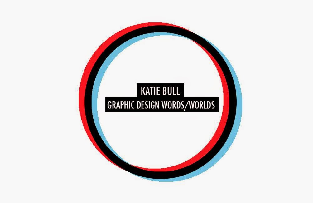
Example of a colour swatch experiment we decided not to choose.


Above are some initial invitation experiments, we tried to do the acetate colour separation but the first try didn't work as we couldn't get the colours quite right. We also didn't like the scribble pattern, it didn't seem clean enough and we wanted more of a sharp design.

This shows the pretty accurate colour representation we came up with for our invitations. To make the acetate work we had to make the colours really bright, if produced they would probably have to be screen printed to reproduce this.
This shows the front and back layout design for the final invitations. We felt the concept of having to look through something to see each perspective was brilliantly fitting for our concept and the final outcome was really effective as it was incredible how well it worked.


In the photos above you can see just how clearly and effectively the colour separation was. We much preferred the design with overlapping type to having a texture involved as it meant the design was still really sharp and minimal so it wouldn't contrast any of the other branding.

This is a poster design we decided not to go for. We wanted really simple posters that appealed to an artistic audience but didn't give too much away about the exhibition, instead entice people in to see it. This was one design idea but we didn't choose it as we wanted something even more minimal as we felt it would be bolder more simple.

As a part of this brief I decided because part of the concept was trying to allow people to be interactive within the exhibition with the anamorphic type I learnt how to make gifs on Photoshop. I used this new skill to experiment with making gifs of the designs I produced. These could then be used as promotion on social media and on the TV's around uni and projected on screen around the exhibition also.

I then saw this poster in Belgrave, Leeds. I loved the overall design and thought having type not running horizontally as you'd expect it to was a really simple way of showing our concept through poster layout.

This design was inspired by this idea, in the end once again we decided it just didn't stand out enough as things seemed too crammed together. Also we decided splitting the title up into two wasn't effective for a poster as it needed to be as bold and legible as possible.

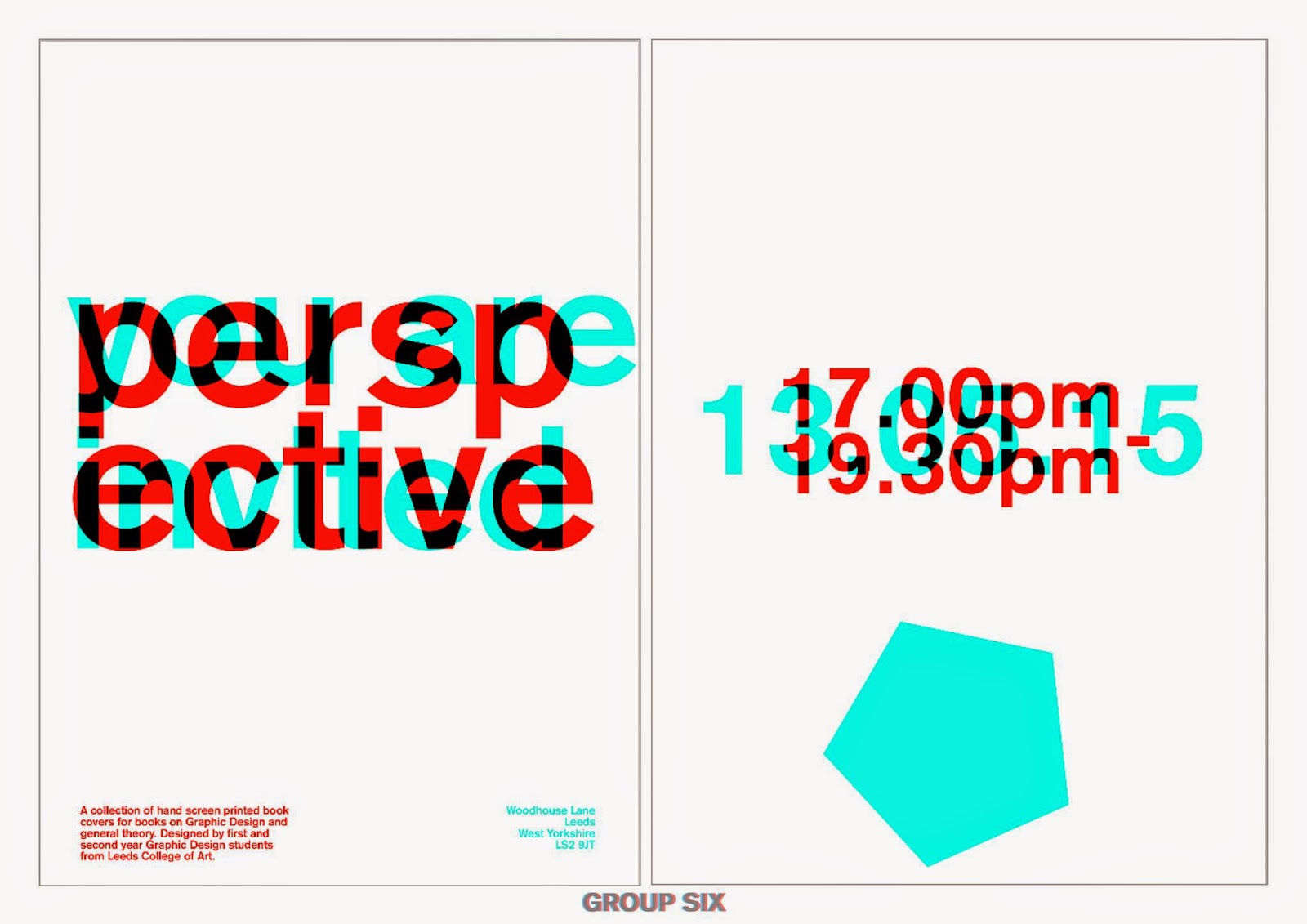
This design was taking the idea of the type not being horizontal but not having it completely vertical so it was still really clean and legible. It is short, sweet and to the point with a perfectly typeset paragraph just telling people the idea behind the exhibition and the dates in the top corner. The 'speckles' were to represent peoples perspectives being in all different directions but....

in the end we decided to get rid of those and simplify it even further to have it as a really minimal design. The frame around the type frames it all together and has the colour separation around it so people will then associate these colours to other pieces of promotion they may see around.

.jpg)
The next idea was to create stickers either as promotion or something people could take away from the exhibition to remember it. The top designs are QR codes linking to the social media pages but we later decided not to use these are it would involve people having to download an app to view and they would probably just be disregarded and ignored. The bottom designs just show examples of possible phrases we could apply to stickers that relate back to the concept.

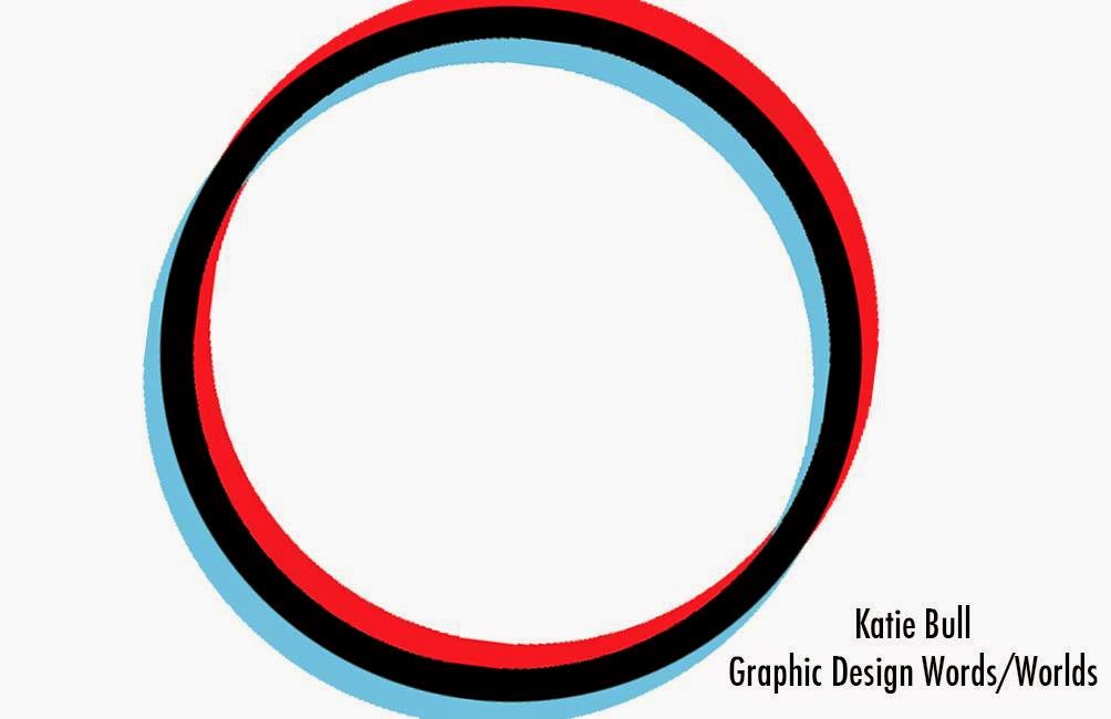
This image shows the final codes for the colour scheme we went for, it took a lot of experimentation but we finally all decided on this and applied it to all the designs we had made so far.

These are a few more colour scheme ideas we previously tried out.


The next thing we wanted to create was a leaflet that told you in depth about the exhibition, the course and the students that produced the work. We wanted an angular theme throughout the book that also tied in with the current brand theme. We did a lot of experimentation with this design. The colour scheme matched perfectly with the rest but the photography aspect didn't work quite as well and looking back on this if we had of won the brief we would of made the booklets aesthetic much simpler.

The really successful part of the book was the spreads displaying the work. Each piece would be photographed or scanned and placed with a number, the numbers would correlate with the order they would be hung within the exhibition. The idea being people could walk around it with the leaflet and know more information about each one and possible circle ones they liked the most in order to contact that particular designer about more work or even buying the artwork after the exhibition.

I also created a more appropriate gif, this one was really simple. it shows the word perspective glitching, this was to capture peoples attention. When its simple it looks pretty boring but then it glitches and you see these exciting bits of colour. The aim was to intrigue people into wanting to know more depth about the exhibition through this.
TYPEFACE- We initially wanted to use Futura medium and condensed, we chose these because of the geometrical qualities as the exhibition space had circles on the ceiling and it seemed appropriate to match that theme. We later changed to just one typeface Akzidenz grotesk, we chose this as its such an impactful looking font, its really bold in both upper and lower case and has really clean lines to keep the whole look of the branding minimal and clean.
No comments:
Post a Comment