
Prior to the final crit I did a second similar design but using another of my vices that has got me through the stress this year, coffee. This time I chose to use a sans serif typeface, I think using a variation of type styles will look more appealing and will encourage and inspire the freshers to not just stick to one and be more adventurous instead.
I presented my two designs in the final crit and explained the concept behind them. The comments I got from this crit were
- Good that if people are scared to try new things this inspires them to do more hands on design
- The image is important
- You could try incorporate the message into the environment somehow
- Add coffee stains? make it more obvious what it is as its not at the moment
- Make the concept more obvious
- Clear aim
- Worded really well - paragraph articulates why you've used negative things
- Maybe separate the type from the poster as at the moment its too small and doesn't really stand out which could confuse the purpose of them.
- You could overlay the type or just create a different layout
- Presents our addictions as students and the idea these 'bad' things can be taken advantage of and made positive
- Gets people to experiment
- The use of unusual and negative material in an attractive way has a shock factor that makes it interesting
I took in all these opinions and it was really helpful in making my idea work together. The main thing I found from the crit was that the message wasn't clear enough until you read the body type so this needed to be bigger for more impact on the design. Because my paragraph starts with 'why why why' I have decided to make another 'why' and have these all on one poster running down the left side then have the paragraph much larger than it is now running down the other side. Having a much more straight to the point design will make the concept and overall message so much clearer. I will use another of my vices to create the final part of the design, alcohol. To show this I will create type from bottle caps.
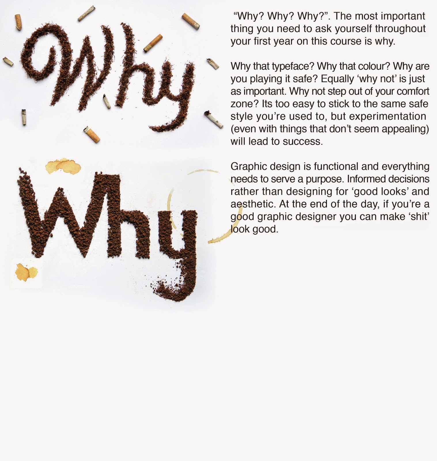
This is my adjusted design so far, I have enlarged the type so its just as impactful as the large images. I have left room for the third and final image at the bottom. I have also added in some coffee stains to make it more obvious that the material used is coffee strengthening the concept. Once this design is finished I will do another crit with people to see if the new layout makes the impact stronger and the concept and informative nature of the design more relevant and obvious.
No comments:
Post a Comment