This blog post has been edited to give less personal and more informed reasons for design decisions (during study task on blogging).

This is the final iconic logo design. The use of leaves is informed by the relevance and iconic nature it has to veganism as a whole. This tied into the negative space element of the design is strong enough to inform the audience of the product with the type being necessary. The green is both informed by the connection to nature a vegan product has and was specifically colour swatched from an image of one of the recipes the company offers.

Despite not including the type within the logo itself the company name should appear as part of the overall branding strategy. Futura has been used as its a widely available font on web and general IT platforms/programmes. Lowercase type was experimented with previously but full capitals instantly created a hierarchy of information, be bold and memorable.
Ideas for deliverables -
- The client has already specified he wants packaging designing as one of the deliverables.
- T-shirts
- Business cards
- Tote bags
- Stickers
- Free sample kits/bags
- Keep it sustainable and recyclable


Experiments with overlaying designs onto different stock samples. Dark brown is less effective as the colours completely change and become unrecognisable in comparison to the rest of the brand. The lighter stock choices are much more effective in creating brand consistency between web media and printed media.

http://www.duncanprint.co.uk/packaging You can produce sustainable packaging, because it isnt recycled it doesnt effect the finish of the print and you have a large range of stock to choose from. Instead for each tree used to create the prints money is donated towards another being planted. If this method is chosen this fact could be a selling point for the product, by saying its sustainable on the packaging and within the promotion of the product.

This is G.F. Smiths manifesto on the environment. Their paper is both party recycled, sustainable and they consider other environmental issues. Another benefit of using their stock is most commercial printers hold their range and sample books so are able to print using their stock at ease.


This G.F.Smith stock is called Gmund Bier Weizen and is available in a wide range of gsm so could be used for multiple reasons (packaging, posters, business cards etc.). Using a slightly off white stock rather than a darker brown one means the colour will not be changed too drastically. The speckled element of this stock suggests the recycled theme to the audience which would be appealing to environmentally conscious vegans (the target audience). For these reasons this is the desired stock for the overall brand strategy.

My proposal for the second deliverable for this brief is tote bags. I wanted to create something that's both promotional and helpful to the environment in some way.

My second idea for collateral is brown paper bags. These could be given to the relevant shops selling the products as a promotional material. The earthy colour stock used for these bags instantly has connotations of nature and environmental kindness. In comparison to plastic bags they are a lot easily recyclable so I think it's a brilliant way to promote the ethics of the company. Also considering the company is just starting up and on a tight budget both the paper bags themselves and the production would be a lot cheaper than screen printing tote bags.
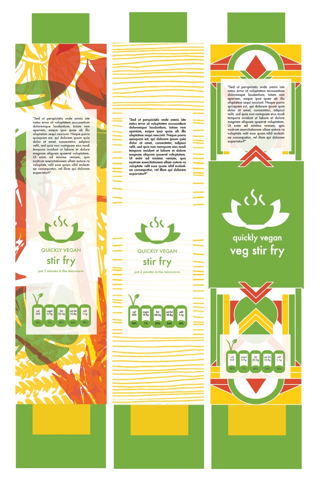
I created 3 design ideas all using the colour scheme I swatched from the recipe photo provided by the client.
- The first design I created illustrations of different plants native to countries from all over the world. The client specified his company aims to create more exotic meals that stand out among the quite bland vegan options already on the market. Including the bright illustrative foliage illustration effectively communicates this element of the brand.
- For my second design I decided to create something really minimal yet still bold and relevant to the product. I started this design with hand drawn/analogue line drawings then developed them into the colour scheme digitally. I think using a hand drawn aesthetic alongside the digital element (logo), is a brilliant way of combining a very personal and organic look and a professional and clean brand. I really like the idea of just using one colour on the packaging alongside the main green of the brand; this colour could change depending on the meal within the package depending on the ingredients and place the recipe comes from and to help the customers differentiate between meals.
- The third design was informed by the idea of using simple and bold geometric shapes to represent the simple yet artistic nature of the culture behind the food whilst maintaining a clean and professional look.
I looked at the requirements of content on food packaging, it requires the ingredients, cooking methods and content of fat, salt etc so the space for these also had to be considered on each design.
No comments:
Post a Comment