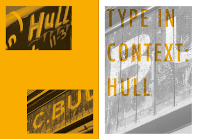
Initial design experiments. The colour orange is iconic to Hull as it represents the football team which is a massive part of the cities culture and pride. These designs aren't as effective as they could be, a more considered and informed layout would be more appropriate.
The colour was changed to blue, swatched from an image of The Deep. Hull is known for being a dock city and most of its traditional trade was done because of the coastline/port. This experiment was done by using the angle of The deeps architecture.
Minimal layout informed by the target audience and focus on the image, yet I still felt the focus was pulled away too much by the type and the hierarchy needed to be more obvious.
After more colour and illustrative experiments I felt the most appropriate way to separate the image from the type completely pulling the image into being the initial focus of the publication was to create an insert within the book.
Inspired by the initial research into Wallpaper guides I felt it would be interesting to document a fact or artistic place within Hull (address and information) within the publication's content. Each piece of information will still be aimed at the creative audience and will be a perfect opportunity to capture creatives attention and draw them to actually going to the growing/changing city whilst appreciating the photographed type.
Above is an example of the inserts layout to be printed double sided and bound into the middle of each spread. Gill sans was chosen as it's an iconic British typeface and shows the heritage location.
The rag of each paragraph has been typeset to look neat and pleasing to the eye as many designers are known to be perfectionists.
A photo and address has been included so if the reader was to use the book as a guide they will know they're in the right location.
The colour/photo has been designed in monochrome as the insert will be printed on coloured stock, the colour being informed by the iconic colours of the location; and the use of multiple stocks being interesting and appealing to the audience.


No comments:
Post a Comment