

Im using the programme JustInMind to create the wireframe design for the website design. I began by mocking up a few designs for the homepage using Futura (as its a font thats compatible with most web browsers) and colours swatched from the album cover.
I began designing on the desktop format for my design so I could minimise areas of content for the smaller tablet and mobile layouts. The issue with this initial design is having the tab options (shop, events, music etc.) along the bottom isn't effective on a mobile format screen as the buttons would be too small and illegible.

As a more effective way of creating web design that is applicable to all formats using a bar along the side with all of the options on and drop down boxes. Drop down boxes allow the user to easily navigate to the part of the site they want all from one place (in the same place on every page). It also allows for sub categories to further the ease of the process creating an easy and interactive user experience.
The orange colour here was used as an experiment, but due to the video background already being really bold and eye-catching colours are less necessary.

During research I came across this image of a type based logo overlaying a textured image. As my sites background will be made up of a colorful video this overlaid technique would be an effective way of integrating the logo within the overall design.

The image above shows how using negative space within the bands logo rather than colour allows the interactive background to become integrated together. The choice to use white boxes and black type has been done to be clear, bold and simple as to not confuse anyone no-matter their experience with technology, the site is designed to be navigated easily and create links and opportunities to pre-order the new album at every opportunity. Futura regular (caps) has been used throughout, firstly as its the typeface used on the album artwork & its widely accepted and available on current versions of web servers.

When speaking to Kimberly Bottomley on the topic of user experience she expressed the effectiveness of transitional visuals, so when you hover over, click on certain elements things happen. This lets the user know things are actually working and happening creating an effective experience. The image above shows in the simplest form how my site design will do this. Each box drops down into sub categories, the box elongates on click letting the user know actions have been taken.

To further the effectiveness of the menu pattern in terms of user experience I decided that when you hover over each option it changes to pink, this allows the user to know where their mouse is quickly and effectively. Also the bright colours (pink) attract users and improve click through rates making it more likely people will navigate through the site. The page the user is currently on/clicked on will appear as purple, this blends in more with the sites background making the other options in turn stand out more in contrast.

Initially I had a video page that when you hover over each one it automatically enlarges and begins playing. But this would then pose the issue of the background video being played at the same time, which is both confusing and would be very slow on low speed broadband.

This is the improved, alternate design for the video page. When the video is selected it becomes the background. Continuing the simple white, square format theme throughout the website on this page. When the video is selected a play button and social media buttons appear at the bottom of the screen; this allows the user to share the videos and site with other people promoting the albums release further.

The photos page will work similarly to the videos as the most recently uploaded images become the sites background, the user can then scroll down through more with options to share them on social media.
Initially I designed the content of each page upon slightly translucent bar than ran through the main page.

But later decided using the standard square format box's throughout the website for continuity was most effective. Using the box's to frame all content allows them to float freely on top of any moving background, photography, video etc. It creates a very diverse layout design overall that can be adapted when needed.

The aim of the website is to produce extra publicity for the band in preparation for the new album in the hope of increasing pre-sales. One element added to the site is a competition/win page, each week a different competition to win tickets etc could be held on here. This example shows how the customer could pre-order the album for a chance to win V.I.P. gig tickets (gives the audience further intensive to make a purchase).

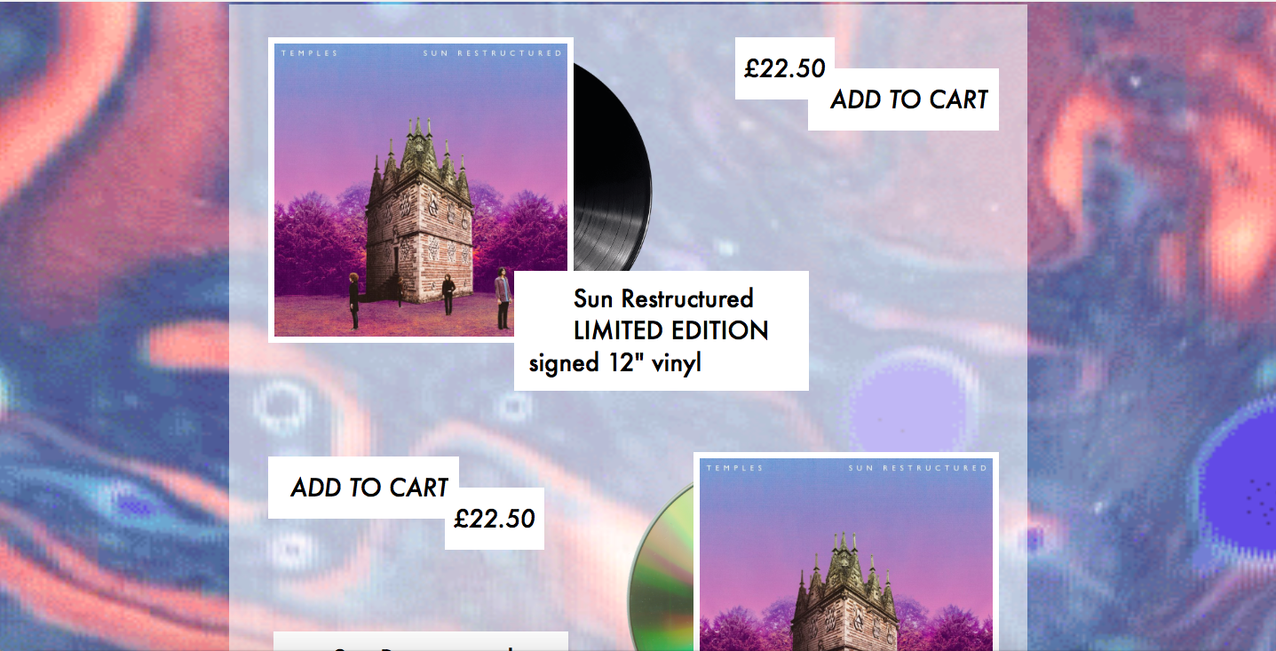
This image shows another use of the same wireframe, this time used to show one of the products with its full description. It demonstrates how the use of a few simple wireframes can be used/spanned out throughout a whole website; this saves both time and money in terms of web production.

This is the prototype for the next desktop layout. As you can see the width allows for up to 3 squares and can be variable depending on the pages content. This example shops the merchandise page (including options to pre-order the album). This layout could also be used to divide up tour dates, competitions, links etc.
For the desktop view to option to hover is available (unlike mobile and tablet) so the information tabs aren't nessicery; instead when the user hovers over each square the title and price in this case appears. When each square is clicked on it takes you to the larger format page with description, option to add to the cart and share.

Due to recent advancements in wifi/broadband technology most people have access to a high speed internet connection. But others may still be on a slow one, to minimise the chance of this effecting anyones user experience whenever the site is loading slowly the spinning vinyl image you see above will appear as a page transition. This lets the user know despite the slow connection the site is still working and hasn't crashed.

Overall the desktop wireframes & prototypes are designed to be easily navigated. This is done by having the navigation/menu bar being visible at all times with selective colours for both hover and click to ensure the smoothest and most effective user experience. The site is essentially made up of 3/4 wireframe designs that are all editable dependent on the specific pages content; having a minimal amount reduces time and cost spent on web development and means adjustments can be made across the entire website rather than page by page.
No comments:
Post a Comment