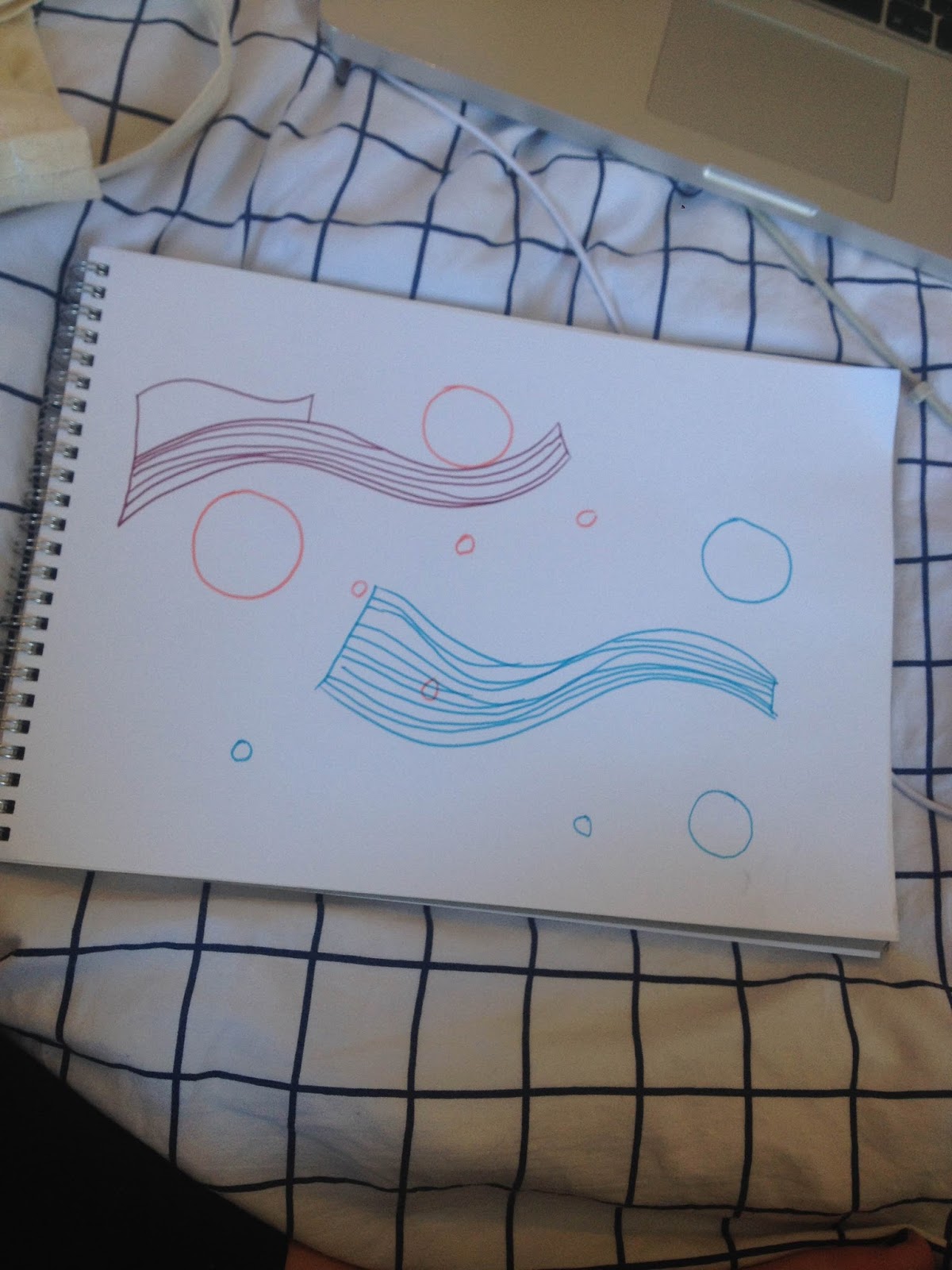
I began my design process by listening to the song deeply and drawing along to the rhythm and allowing myself to really visualise how the song sounds in an abstract way.


During this brief I discovered the illustrators Mrzyk & Moriceau, their style is really simplistic yet cleverly comical. I felt this light hearted approach to design would be something that would stand out to the judges as nobody can resist something they can laugh at.

Even today Etta James and her bright blonde hair is a quite recognisable figure within popular media. I felt I could make the most of that by incorporating her into a lighthearted illustration that was also informed by the overall meaning & warmth of the song.
Initial ideas included -
- Comical love scene with Etta James in, based upon a popular chick flick (mean girls, the notebook etc.)
- Etta floating with balloons
- Laid in a field of flowers (your typical cheesy romance scene)

I used the various photographs of Etta James online as sources for the illustration. I decided to show her floating around due to being tied to balloons. I felt this concept is appropriately informed by the flowing (long held notes and general genre) sound of the song. It represents the happy feeling of being 'above the cloud' when your around the person you love which is what the song portrays.


These are some variations of the design I created. I experimented with natural colour schemes and also a harsh black and white aesthetic inspired by the work of M & M. I really found that the combination of the natural coloured design and the black background were really strong as each element works together to instantly attract your eye towards the main figure.


In the end the decision of which one to submit came down to the mock ups to allow myself to really visualise what the designs would look like printed and displayed to the judges. I decided the yellow design with the white background is the most effective as both white and yellow are really positive colours so it's appropriate the positivity and happiness within the song. Due to the sharpness of the yellow the design manages to be both minimal and bold simultaneously which is successful for the environment it would be displayed in.
No comments:
Post a Comment