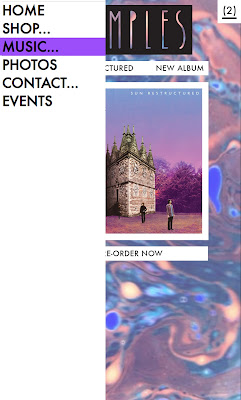
Essentially the aesthetic decisions within the mobile layout are all the same as the desktop. But allowances and changes need to be made for the change in format; for example one box per width rather than 3. Another consideration is that touch screen technology doesnt recognise hover so labels need to be added to inform the audience about each element.
I changed the design a little so it was more consistent with the desktop design. Rather than offsetting images and type the alignment is central with the slimline nav-bar on the left and a smaller version of the shopping basket to the right.
When the user is to click/touch the expansion logo on the slim side bar it spans outward to reveal the same style navigation bar as the desktop design uses. Due to the lack of mouse hover the pink transition is no-longer available but when a page is selected it will display as purple and the side bar will automatically shrink down again.
Secondly the selection page becomes one square per line rather than 3. The customer can scroll through each option then click the title to find out more about that product in particular.
The layout with information barely changes, the image just becomes the track list etc. The simple transitions between pages creates ease for the web developers and the loading time improving the overall user experience.
This displays a pop up overlay screen, it confirms the addition of items to the basket as phone sites usually take longer to navigate (and edit shopping carts) than it does on desktop. This idea is about increasing the ease of purchase for the user, to give them options to improve this experience as much as possible; without this they could accidentally add things that are unwanted which is frustrating.
Similarly to the desktop design the video and photograph pages are made to fill the entire background to allow for full viewer experience & opportunities to share via social media. Because of the standard landscape format of videos this option will urge the user to turn their device onto its side as they watch/scroll.
The mobile design is much less complex that the desktop as its working with a much smaller space and the information still needs to be clear and legible. Each wireframe and prototype is less varied, this leads to simplicity of use and production.


No comments:
Post a Comment