Sunday 31 January 2016

~ Secret 7 - John Lennon ~


This is considered a legendary track with really heartfelt and meaningful lyrics which is why my first instinct before thoughts on the design was to fully read and study them.

Imagine there's no heaven
It's easy if you try
No hell below us
Above us only sky
Imagine all the people
Living for today...

Imagine there's no countries
It isn't hard to do
Nothing to kill or die for
And no religion too
Imagine all the people
Living life in peace...

You may say I'm a dreamer
But I'm not the only one
I hope someday you'll join us
And the world will be as one

Imagine no possessions
I wonder if you can
No need for greed or hunger
A brotherhood of man
Imagine all the people
Sharing all the world...

You may say I'm a dreamer
But I'm not the only one
I hope someday you'll join us
And the world will live as one


Essentially the song is about John Lennon's dreams about a peaceful world without war, famine and hate. 

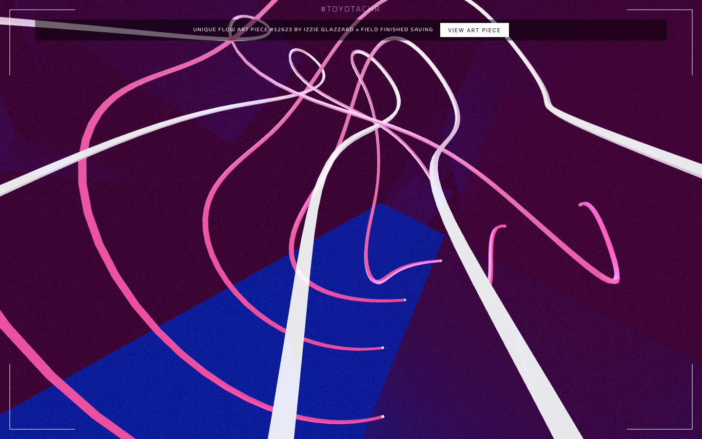
http://www.itsnicethat.com/articles/make-your-own-piece-of-hypnotic-digital-art-with-field?utm_source=facebook&utm_medium=social&utm_campaign=intuniqueflow


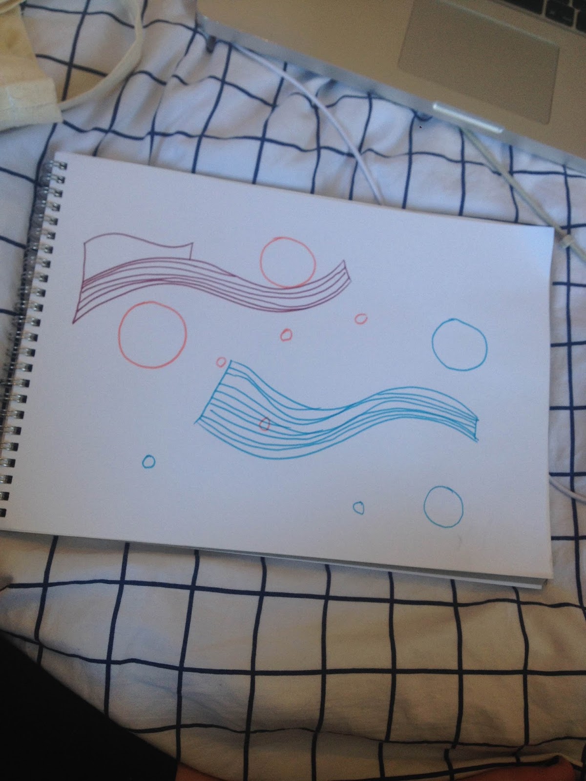
As an initial source of brain exercise to begin thinking of concepts visually for this brief. This application allows you to create colourful visuals according to the letters you type.

This allowed me to begin thinking out of the box for this particular design. Most of my designs so far were quite directing informed either by the lyrics or the artist themselves. I feel 'Imagine' is still a really impactful song on society as it addresses issues to do with in-equality. Some of the the current issues with society that are relevant to this song in contemporary culture include...

- Sexism
- Racism
- Transphobia
- Homophobia


Friday 29 January 2016

~ Responsive - penguin book cover - submission ~


This is the final submission for my 'A Clockwork Orange' book cover design. As specified the submission consists of a 2 page pdf with the cover and full spread design included.


If my design completes this round of judging they will contact me with any possible changes to the design they may want for final choosing.

~ Responsive - Brompton bikes - initial ideas ~


This is a brief I will be entering as part of responsive, the outcome of which needs to be a video or animation promoting the release of their new bike. I began my research by looking through the Instagram hashtag for the competition to see previous entires. 


Currently all the entries are film based and all include the physical bike itself. I do not own the bike the competition is for which in part puts me at a disadvantage; however another way to look at this is in an animation perspective. Stop animation allows me to create a submission for the brief without the use of the bike and will stand out among the film based submissions.


https://vimeo.com/101653823


https://vimeo.com/82541714 - Examples of 2d papercut and 3d paperfolding stop motion animations by giulia tibaldi & giordano garosio. Their use of bright coloured paper is appealing, attractive and iconic.


Snask's animation work for Malmo festival is a brilliant example of the use of paper and objects in conjunction together to make an effective design.


The overall aesthetic of the brand it-self is colourful and bright to attract in a range of audiences the bike is completely customisable by colour. This is an aspect I need to consider within my outcome; the route of paper animation is an appropriate route and a brightly coloured range of papers could be used to represent the bikes diversity in style.


This is part of the Brompton bikes logo and it appears throughout the site and social media regularly. The bike has been split into different simple shapes and lines; these will be helpful when producing the final paper design.


Thursday 28 January 2016

~ Secret 7 - Etta James ~


I began my design process by listening to the song deeply and drawing along to the rhythm and allowing myself to really visualise how the song sounds in an abstract way.


During this brief I discovered the illustrators Mrzyk & Moriceau, their style is really simplistic yet cleverly comical. I felt this light hearted approach to design would be something that would stand out to the judges as nobody can resist something they can laugh at. 


Even today Etta James and her bright blonde hair is a quite recognisable figure within popular media. I felt I could make the most of that by incorporating her into a lighthearted illustration that was also informed by the overall meaning & warmth of the song.

Initial ideas included -
- Comical love scene with Etta James in, based upon a popular chick flick (mean girls, the notebook etc.)
- Etta floating with balloons 
- Laid in a field of flowers (your typical cheesy romance scene)


I used the various photographs of Etta James online as sources for the illustration. I decided to show her floating around due to being tied to balloons. I felt this concept is appropriately informed by the flowing (long held notes and general genre) sound of the song. It represents the happy feeling of being 'above the cloud' when your around the person you love which is what the song portrays.


These are some variations of the design I created. I experimented with natural colour schemes and also a harsh black and white aesthetic inspired by the work of M & M. I really found that the combination of the natural coloured design and the black background were really strong as each element works together to instantly attract your eye towards the main figure. 


I find the most iconic feature of Etta James herself to this day is her bright blonde hair; in this style of illustration this translates into a sharp, bright bold yellow colour. I decided to experiment with incorporating this colour into the design as it instantly would stand out even among a stand with 99 other designs on. I felt this design whilst still minimal is really effective.


In the end the decision of which one to submit came down to the mock ups to allow myself to really visualise what the designs would look like printed and displayed to the judges. I decided the yellow design with the white background is the most effective as both white and yellow are really positive colours so it's appropriate the positivity and happiness within the song. Due to the sharpness of the yellow the design manages to be both minimal and bold simultaneously which is successful for the environment it would be displayed in.

Tuesday 26 January 2016

~ Secret 7 - The Jam ~


The idea of non conformity is something I wish to express within my design by manipulating simple geometry and symbolism informed by the bands style and culture. 


This initial experimentation shows where i've taken the iconic mod symbol and played around with it to show it 'melting' and becoming fluid. This is the kind of outcome i'd like my final design to express but executed in an effective and relevant way.

As a part of this brief I wanted to experiment with different techniques for each of my outcomes. Due to the songs title 'art school' I feel its most relevant to use a markmaking/hands on process to create the design.


Each year the holders of the competition send out blank sleeves to design upon around the country. If I can get hold of one of these it gives me the opportunity to think of a design that can be fully appreciated in person and looks preferable to a digital version. This possibility made me think about approaching this song with papercutting.


Papercutting is a technique that can only be fully appreciated in person as a digital scan/photograph of the design doesnt allow you to fully see the intricacy of the cuts and time gone into it. So this lead to the decision to produce a papercut method design for this song. 


This is my final papercut before it was placed upon the physical entry sleeve. I used a bright off-red colour stock as it was the right gsm to be easily cut and effective in depicting the iconic colour that surrounded The Jam and Mod culture at the time the song was released. 


This is my final submission for the physical element of secret 7 - The Jam. I think it successfully delivers a concept incorporating the era and social movements surrounding the time. It also shows my interpretation of the song and whole culture of art school and breaking the boundaries of standardised society. 


Monday 25 January 2016

~ Secret 7 - The Jam ~


The Jam are a legendary punk rock/mod band most known in the 70/80's. This song 'art school' was never released as a single so this secret 7 will be a first for the song. 


This example of their previous artwork features the iconic symbol of mod style (the dartboard circle), this element of design is iconic to the movement and is something I will consider working into my design.

Iconic elements of the mod subculture include-
- red, white and blue (patricarcial colours)
- tailored suits
- vespas & lambrettas
- drugs (amphetamines) 
- known for conflict with rockers


During visual research I came across this image, its inspiring as I feel its relevant to the songs title. It uses the iconic mod symbol but has drops of colour bleeding out from it.

I think 'art school' as a whole represents the idea of non-conformity to society and popular belief systems; something it has in common with sub-cultures and their rebellion. My inital concept is to create a design based around this idea of none conformity and 'breaking the circle'. I want my design to display both the visual culture of the mod subculture with my personal contemporary twist.